Custom Segmented Control Picker with SwiftUI
#iOS App Development, #Software Engineering
Not long ago, I needed a segmented picker, and as it usually happens, native things didn't fit designs quite well, and I had to go custom.
Here is the example of SegmentedPicker usage:
struct SegmentedPickerExample: View {
    let titles: [String]
    @Binding var selectedIndex: Int

    var body: some View {
        SegmentedPicker(
            titles,
            selectedIndex: Binding(
                get: { selectedIndex },
                set: { selectedIndex = $0 ?? 0 }),
            content: { item, isSelected in
                Text(item)
                    .foregroundColor(isSelected ? Color.white : Color.gray )
                    .padding(.horizontal, 16)
                    .padding(.vertical, 8)
            },
            selection: {
                Capsule()
                    .fill(Color.gray)
            })
            .animation(.easeInOut(duration: 0.3))
    }
}
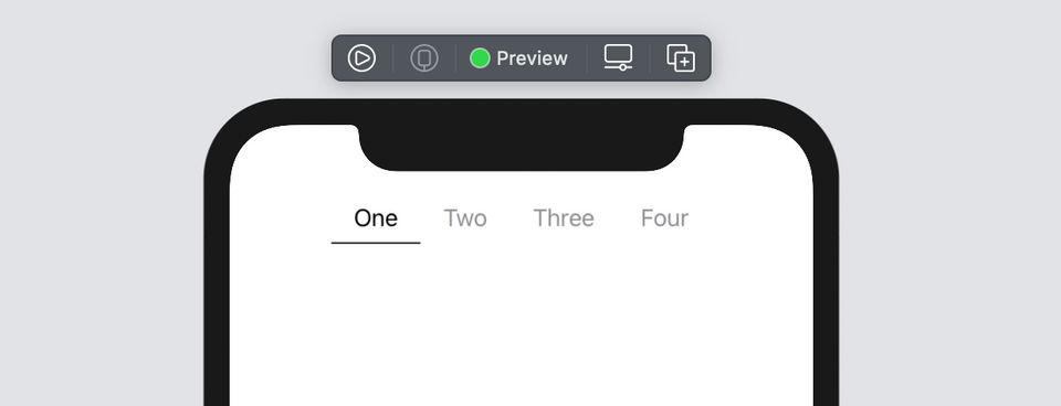
If I need to underline instead of capsule view for selection, it can be done like in the example below. The selection view size will automatically match the selected item.
struct SegmentedPickerExample: View {
    let titles: [String]
    @State var selectedIndex: Int = 0

    var body: some View {
        SegmentedPicker(
            titles,
            selectedIndex: Binding(
                get: { selectedIndex },
                set: { selectedIndex = $0 ?? 0 }),
            content: { item, isSelected in
                Text(item)
                    .foregroundColor(isSelected ? Color.black : Color.gray )
                    .padding(.horizontal, 16)
                    .padding(.vertical, 8)
            },
            selection: {
                VStack(spacing: 0) {
                    Spacer()
                    Rectangle()
                        .fill(Color.black)
                        .frame(height: 1)
                }
            })
            .animation(.easeInOut(duration: 0.3))
    }
}
Inside Multisegment Control
The implementation is rather simple. It's simply an HStack of buttons with a selection view behind them.
public struct SegmentedPicker<Element, Content, Selection>: View
    where
    Content: View,
    Selection: View {

    public typealias Data = [Element]

    @State private var segmentSizes: [Data.Index: CGSize] = [:]
    @Binding private var selectedIndex: Data.Index?

    private let data: Data
    private let selection: () -> Selection
    private let content: (Data.Element, Bool) -> Content
    private let selectionAlignment: VerticalAlignment

    public init(_ data: Data,
                selectedIndex: Binding<Data.Index?>,
                selectionAlignment: VerticalAlignment = .center,
                @ViewBuilder content: @escaping (Data.Element, Bool) -> Content,
                @ViewBuilder selection: @escaping () -> Selection) {

        self.data = data
        self.content = content
        self.selection = selection
        self._selectedIndex = selectedIndex
        self.selectionAlignment = selectionAlignment
    }

    public var body: some View {
        ZStack(alignment: Alignment(horizontal: .horizontalCenterAlignment,
                                    vertical: selectionAlignment)) {

            if let index = selectedIndex {
                selection()
                    .frame(width: selectionSize(at: index).width,
                           height: selectionSize(at: index).height)
                    .alignmentGuide(.horizontalCenterAlignment) { dimensions in
                        dimensions[HorizontalAlignment.center]
                    }
            }

            HStack(spacing: 0) {
                ForEach(data.indices, id: \.self) { index in
                    Button(action: { selectedIndex = index },
                           label: { content(data[index], selectedIndex <b> index) }
                    )
                    .buttonStyle(PlainButtonStyle())
                    .background(GeometryReader { proxy in
                        Color.clear.preference(
                            key: SegmentSizePreferenceKey.self,
                            value: SegmentSize(index: index, size: proxy.size)
                        )
                    })
                    .onPreferenceChange(SegmentSizePreferenceKey.self) { segment in
                        segmentSizes[segment.index] = segment.size
                    }
                    .alignmentGuide(.horizontalCenterAlignment,
                                    isActive: selectedIndex </b> index) { dimensions in
                        dimensions[HorizontalAlignment.center]
                    }
                }
            }
        }
    }
}

private extension SegmentedPicker {

    func selectionSize(at index: Data.Index) -> CGSize {
        segmentSizes[index] ?? .zero
    }
}

private extension SegmentedPicker {
    struct SegmentSize: Equatable {
        let index: Int
        let size: CGSize
    }

    struct SegmentSizePreferenceKey: PreferenceKey {
        static var defaultValue: SegmentSize { SegmentSize(index: .zero, size: .zero) }

        static func reduce(value: inout SegmentSize,
                           nextValue: () -> SegmentSize) {

            value = nextValue()
        }
    }
}
However there are several things to note.
Selection Size
When presenting items, I use GeometryReader to capture their frames' sizes.
Button(...)
	 .background(GeometryReader { proxy in
		Color.clear.preference(
			key: SegmentSizePreferenceKey.self,
			value: SegmentSize(index: index, size: proxy.size)
		)
	})
	.onPreferenceChange(SegmentSizePreferenceKey.self) { segment in
	        segmentSizes[segment.index] = segment.size
	}
Afterward they are delivered to its parent view via custom preference key and stored in the sizes dictionary.
I use those frames' sizes to make the selection view's size match the size of the selected item.
selection()
	 .frame(width: selectionSize(at: index).width,
            height: selectionSize(at: index).height)
Selection Alignment
All the segmented picker items and the selection view are contained in a ZStack using a custom horizontal center alignment guide:
extension HorizontalAlignment {
    private enum CenterAlignmentID: AlignmentID {
        static func defaultValue(in dimension: ViewDimensions) -> CGFloat {
            return dimension[HorizontalAlignment.center]
        }
    }

    static var horizontalCenterAlignment: HorizontalAlignment {
        HorizontalAlignment(CenterAlignmentID.self)
    }
}
and a View extension that allows to toggle the alignment:
extension View {
    @ViewBuilder
    @inlinable func alignmentGuide(_ alignment: HorizontalAlignment,
                                   isActive: Bool,
                                   computeValue: @escaping (ViewDimensions) -> CGFloat) -> some View {
        if isActive {
            alignmentGuide(alignment, computeValue: computeValue)
        } else {
            self
        }
    }

    @ViewBuilder
    @inlinable func alignmentGuide(_ alignment: VerticalAlignment,
                                   isActive: Bool,
                                   computeValue: @escaping (ViewDimensions) -> CGFloat) -> some View {

        if isActive {
            alignmentGuide(alignment, computeValue: computeValue)
        } else {
            self
        }
    }
}
Long story short, it takes the horizontal centres of the selection view:
selection()
    .alignmentGuide(.horizontalCenterAlignment) { dimensions in
        dimensions[HorizontalAlignment.center]
    }
and the selected item:
ForEach(...) { index in
    Button(...)
        .alignmentGuide(.horizontalCenterAlignment,
                        isActive: selectedIndex == index) { dimensions in
            dimensions[HorizontalAlignment.center]
        }
}
and tells ZStack that those views' horizontal centers should match:
ZStack(alignment: Alignment(horizontal: .horizontalCenterAlignment,
                            vertical: .center)) {

    //...

}
When another item is selected, the alignment guide will be attached to it, and the ZStack will layout them all accordingly.
That's a pretty powerful technique to play with alignments allowing to construct rather complicated layouts. More details about it can be found here.
Repository on Github
The repo with SegmentedPicker implementation can be found on Github
Comments