What's new in SwiftUI – WWDC2022
#iOS App Development
Swift Charts
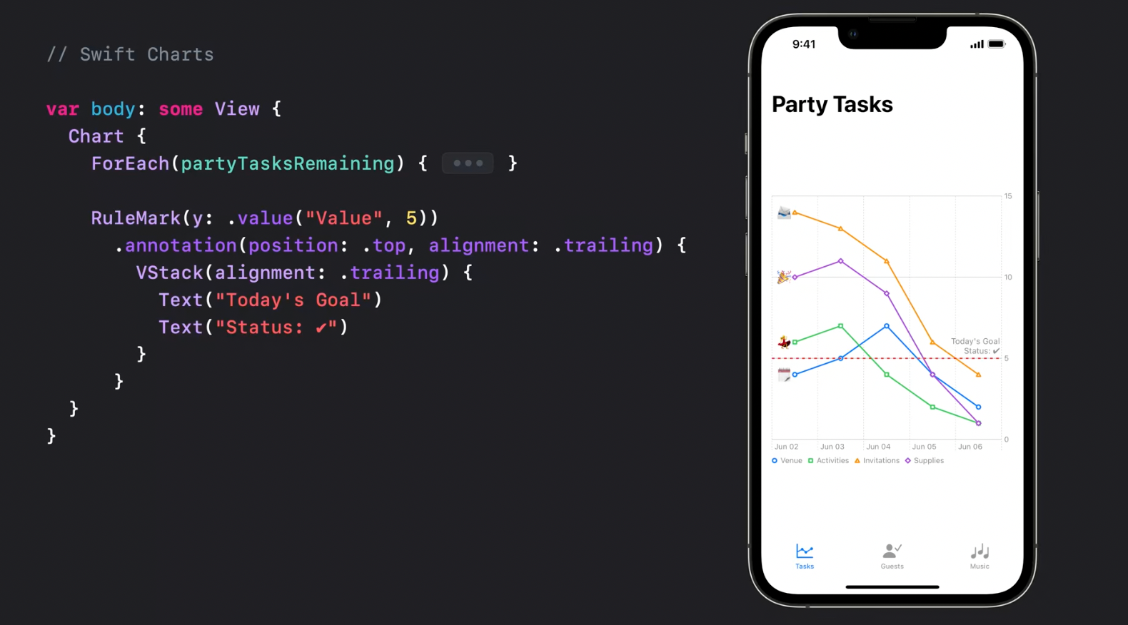
Charts is a new framework for building data-driven charts. Since Charts conform to View protocol all charts can be seamlessly integrated into SwiftUI-powered UI.
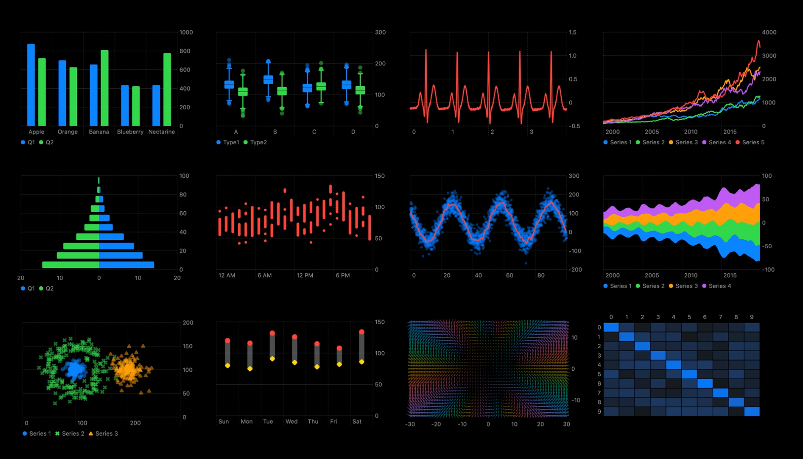
Looks very easy to use and customize.
Bar chars:
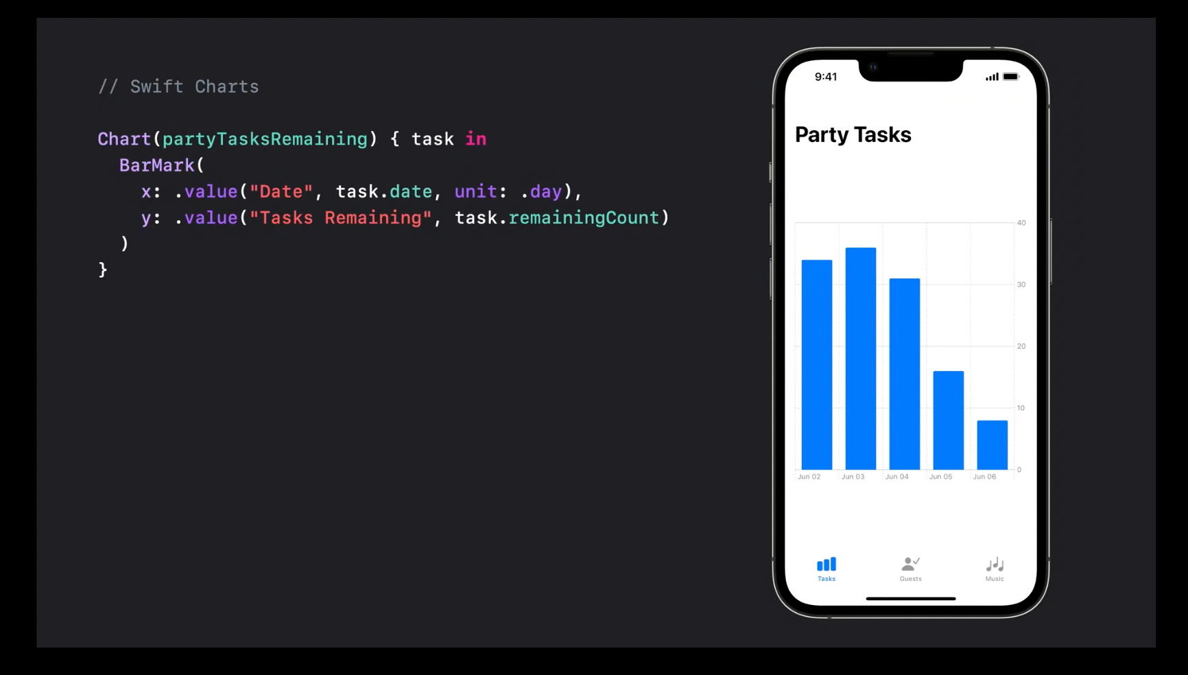
Line charts:
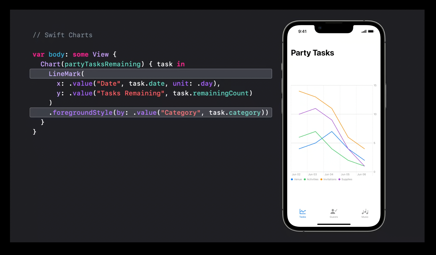
Allows to configure symbols, annotations
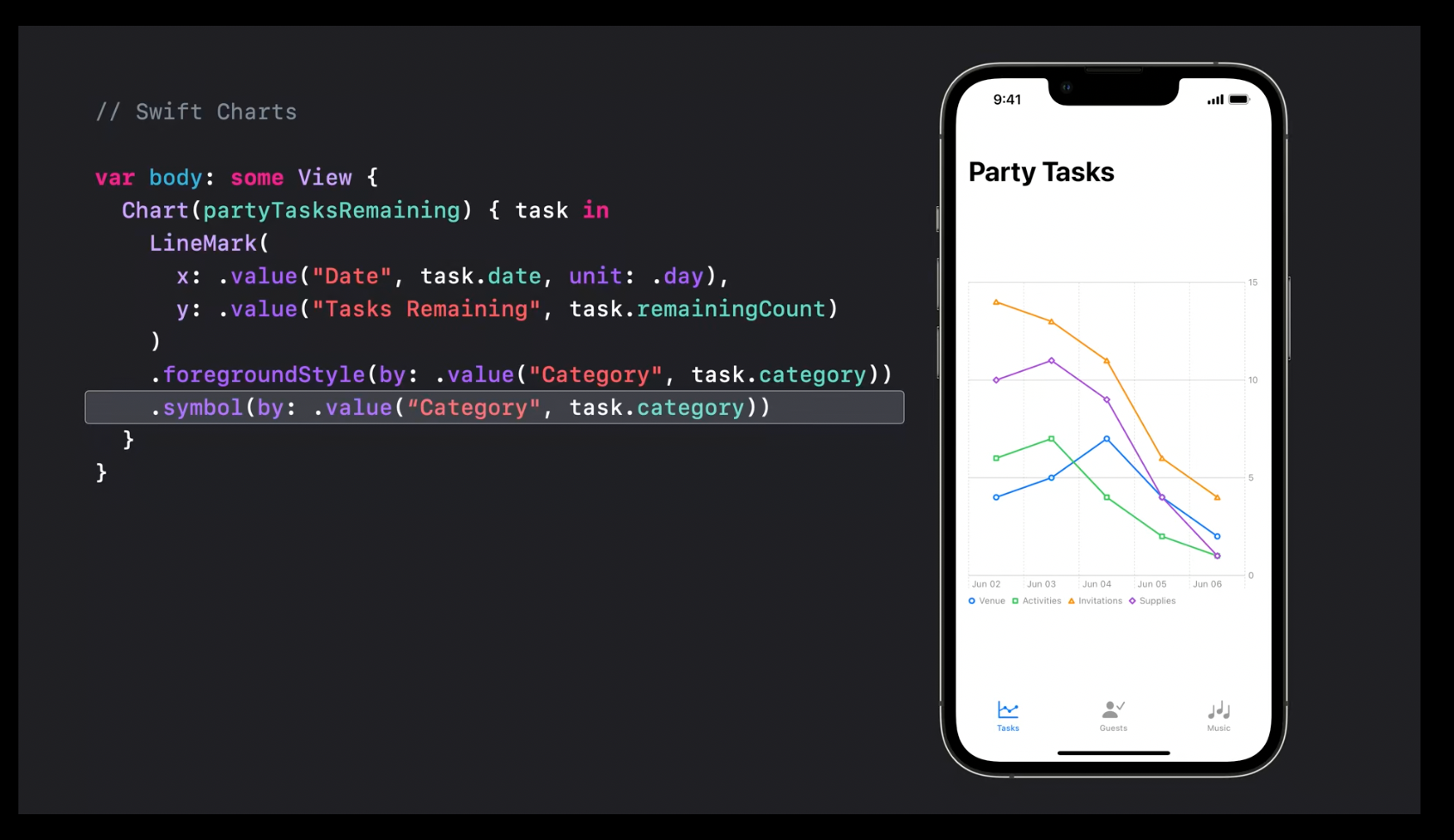
and even combine several charts into one using ForEach:
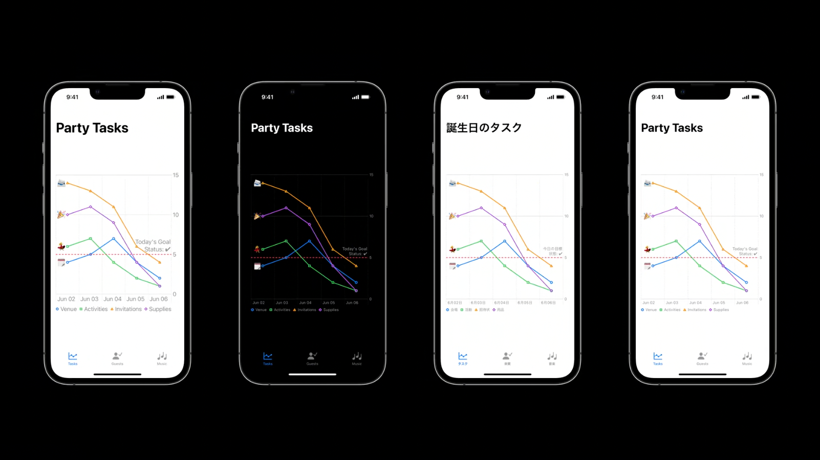
Charts also support dynamic type, dark mode and localization automatically and are available for all the platforms.
Recommended to watch:
- Hello Swift Charts - WWDC22
- Swift Charts: Raise the bar - WWDC22
Navigation and Windows
Not without problems, but SwiftUI has already been capable of common navigation patterns like push and pop navigation stacks, split views for list -> detail navigation pattern, and multi-window modes for MacOS
Navigation Stacks
This year Apple introduced a brand new container called NavigationStack for push-pop style navigation.
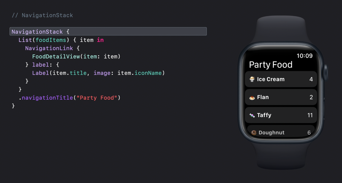
Looks almost exactly like its predecessor - NavigationView with NavigationLink.
However, data-driven navigation now looks a little bit different and uses navigationDestination modifier.
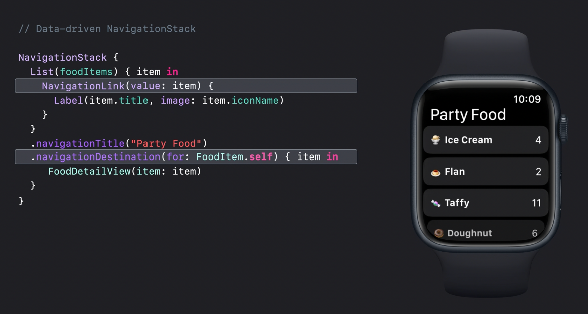
NavigationView used to be 100% state-driven with a binding to a bool value that controlled the whole presentation. Under the hood, it used plain old good UINavigationViewController.
I played a lot with NavigationView before and I even tried to implement my own and I always had troubles.
There was a lot of pain related to keeping the animated asynchronous navigation stack presentation in sync with the state. I tried a couple of times and the whole thing was so ugly and buggy that I gave up.
From what I see now from the API, it looks like Apple did the same and moved from state-driven navigation to actions/event-driven.
NavigationLink is likely to handle a tap like a button and pass the item right to the closure from navigationDestination, then it gets the destination view, wraps it into a UIHostingVIewController, and pushes it to the navigation stack.
The example batch navigation looks very interesting and allows to jump back to any depth of the navigation stack.
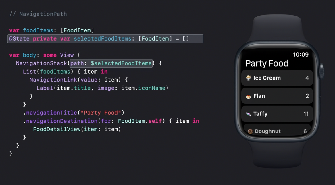
I'm interested in how it would cope with a presentation of a deep stack of items at once.
Split Views
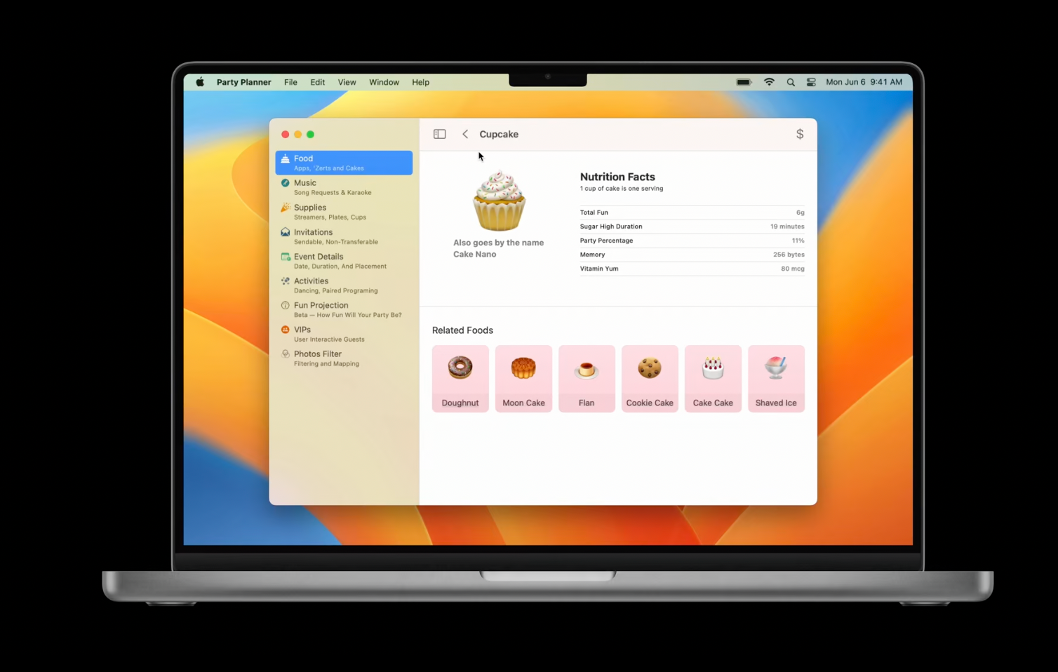
NavigationSplitView is a brand new container for list -> detail presentation. It's rather powerful. First of all, it supports two and three-column layouts.
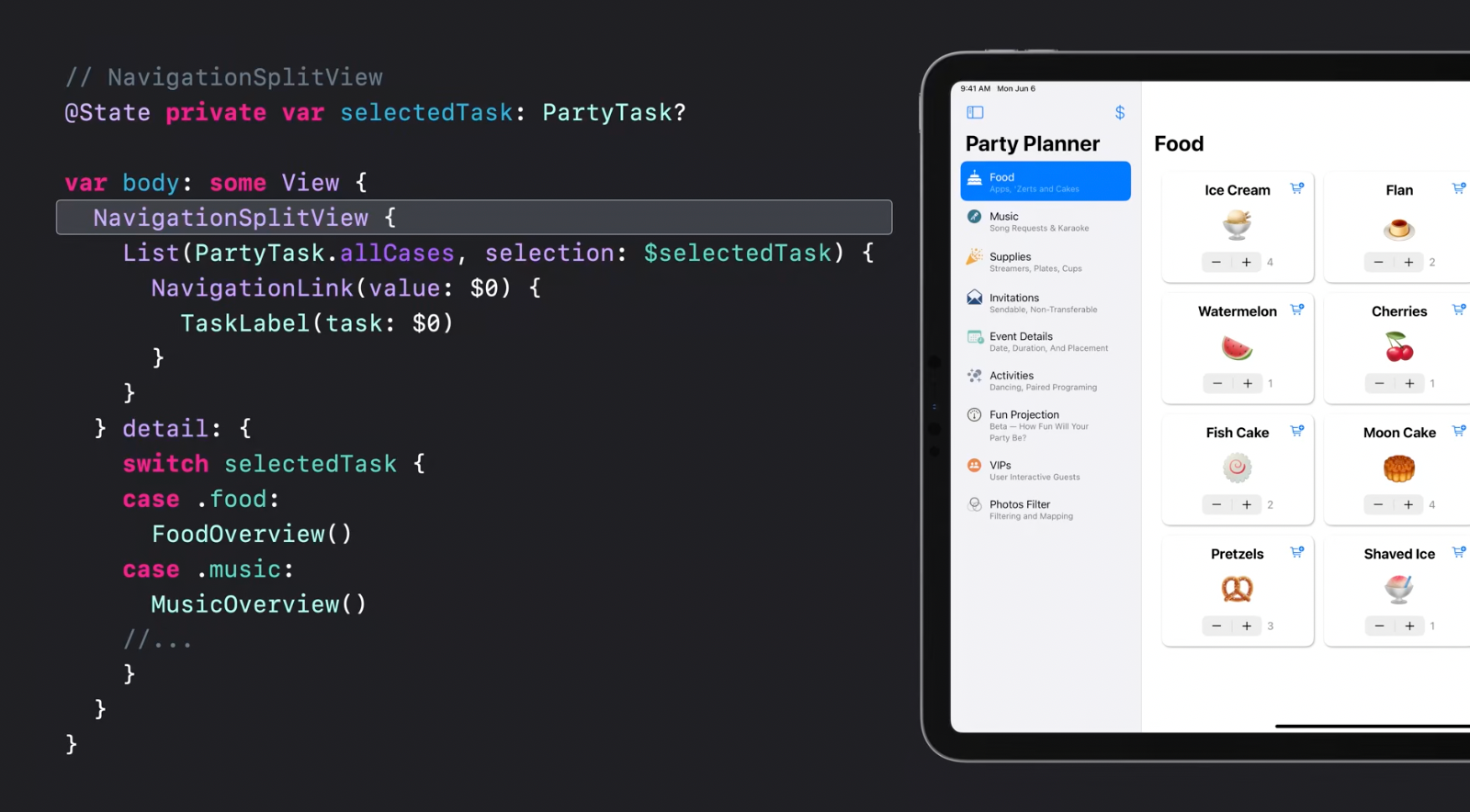
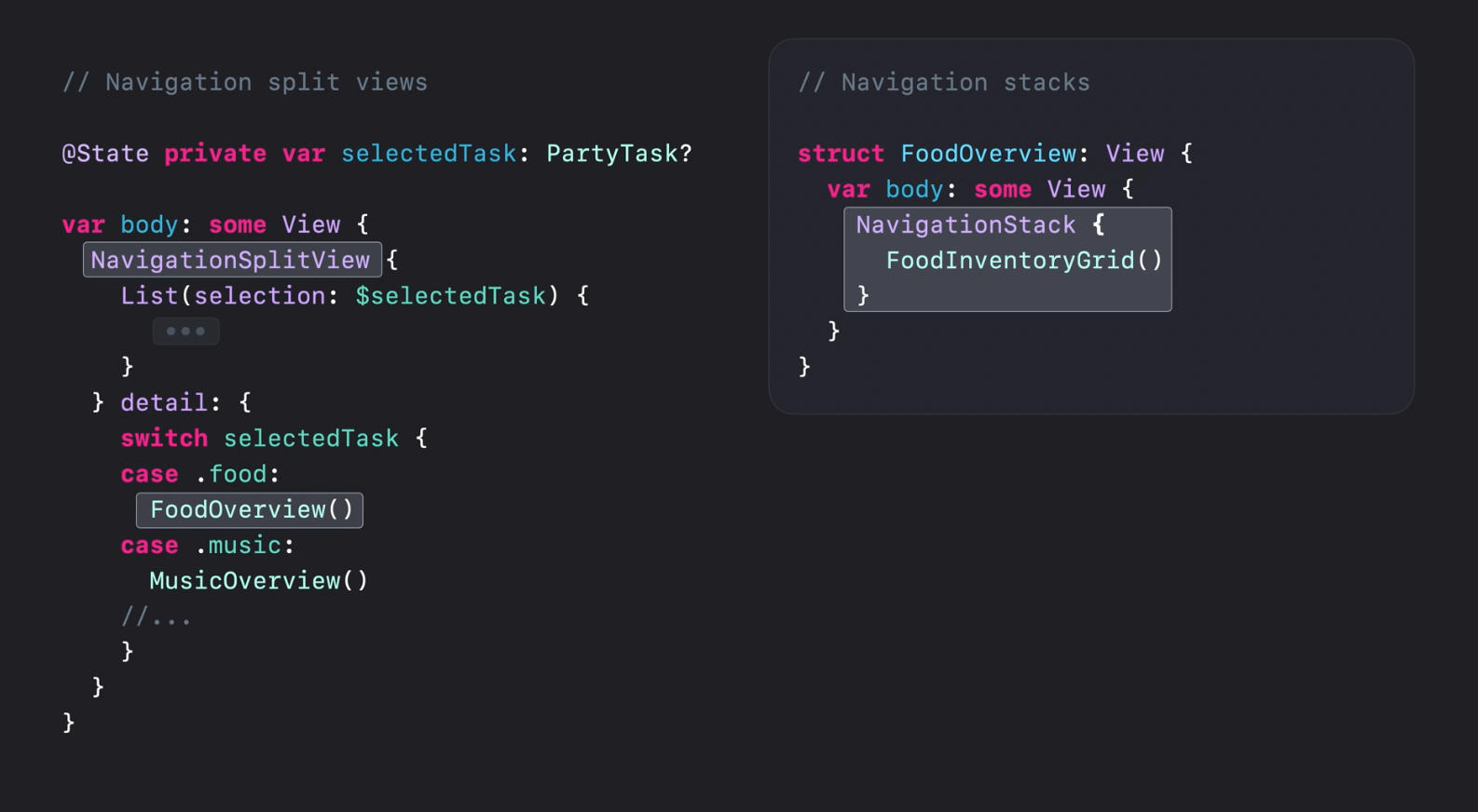
It uses NavigationLink to bind the selected value that is later used for detail view presentation:
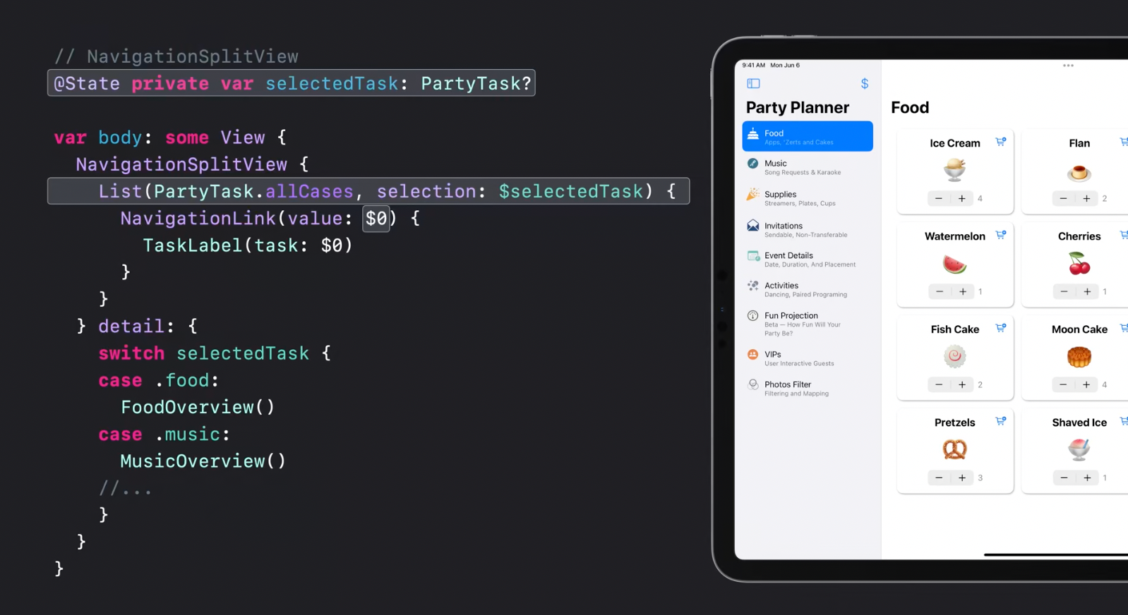
NavigationSplitView automatically collapses into a NavigationStackView for compact size classes.
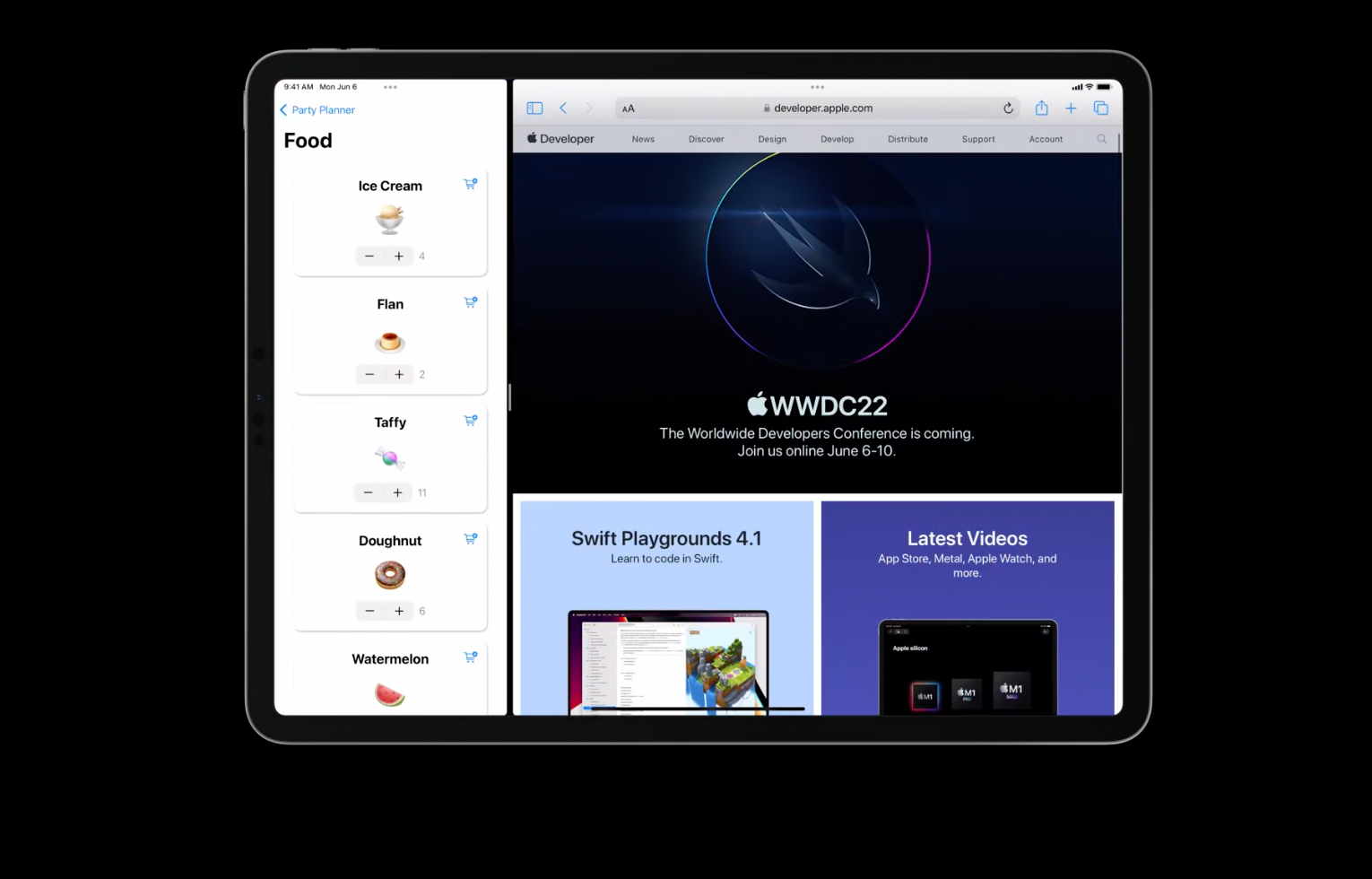
NavigationSplitView and NavigationStackView can be nested one into another allowing to build complex navigation structures for MacOS and iPadOS:
Recommended to watch:
- The SwiftUI cookbook for navigation - WWDC2022
Scenes
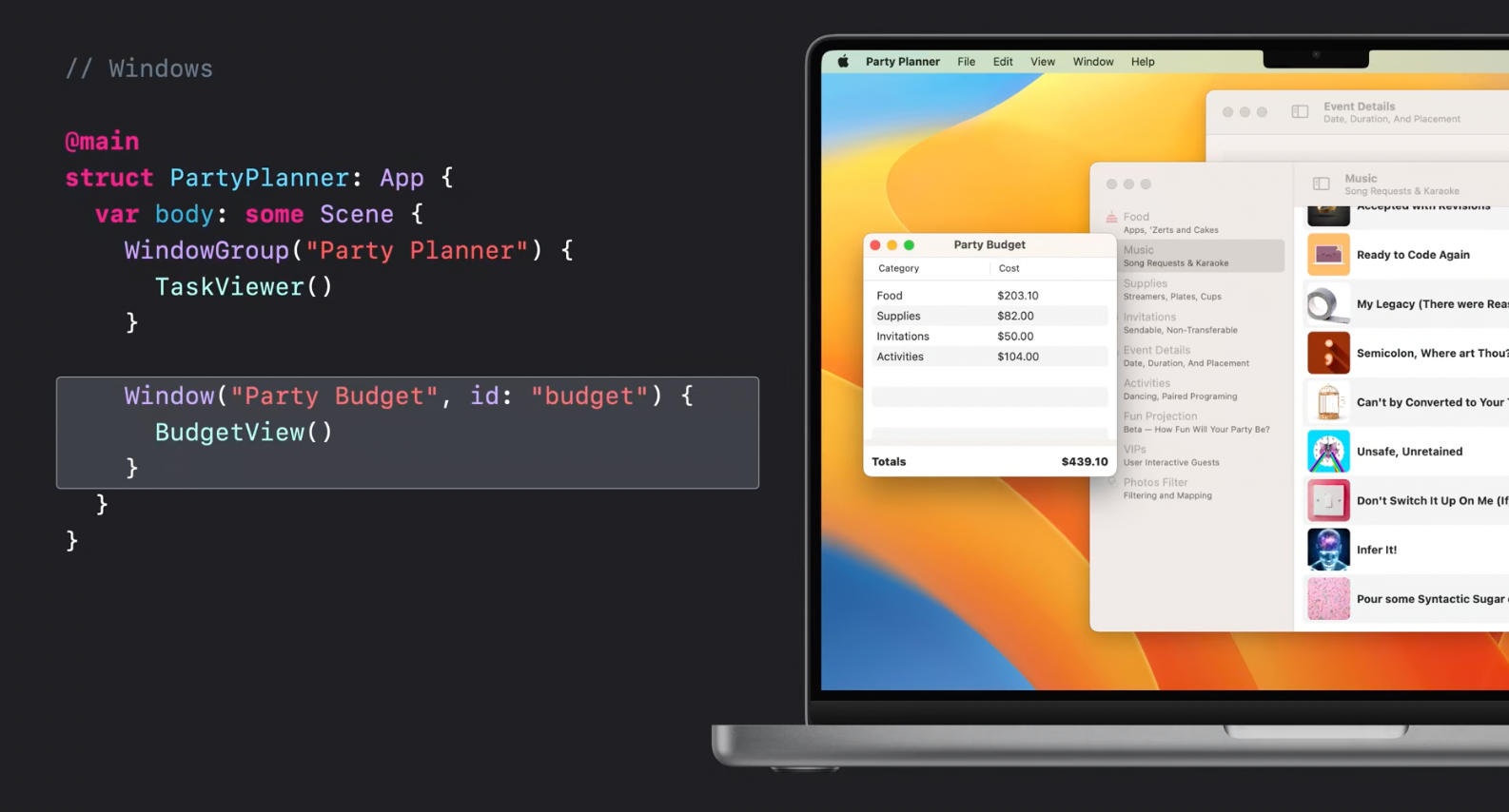
Window
Additionally to the WindowGroup,
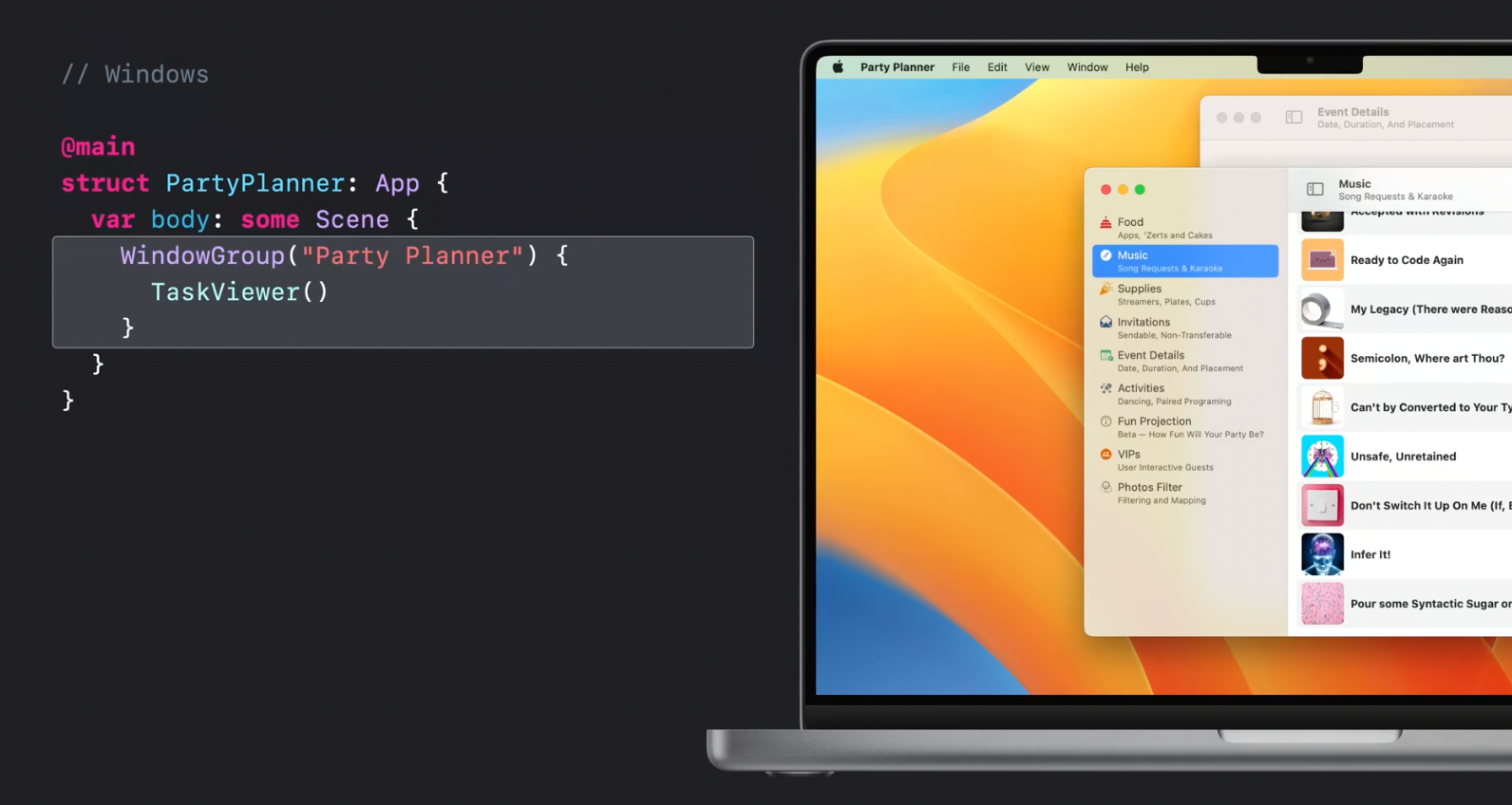
Window has been introduced this year, allowing to build multi-window apps with SwiftUI.
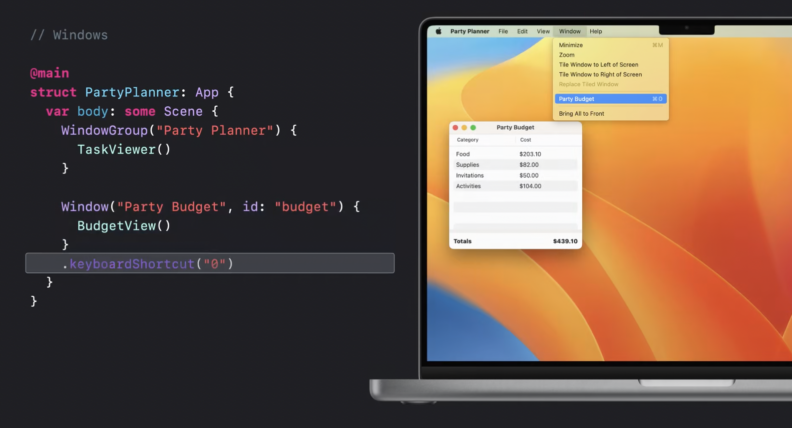
Window allows to add a keyboard shortcut to jump between windows just in one line:
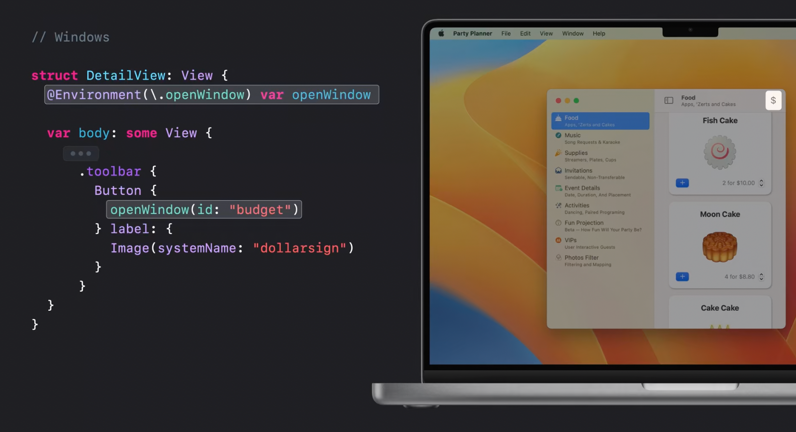
Now there is a new way to open Windows programmatically with a help of a new openWidnow environment var. For example on a tap of a button:
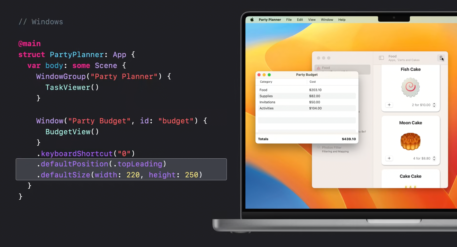
Window is shipped with new modifiers allowing to specify default new window positions and size:
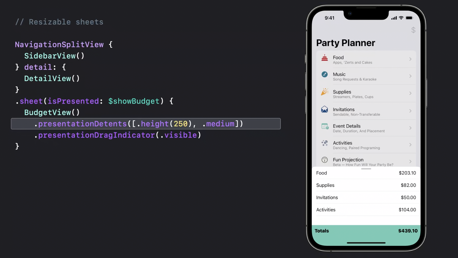
Here is a "real-life" multiplatform example showing how a view presented as sheet on iOS will be presented as a separate Window when an app is run on MacOS:
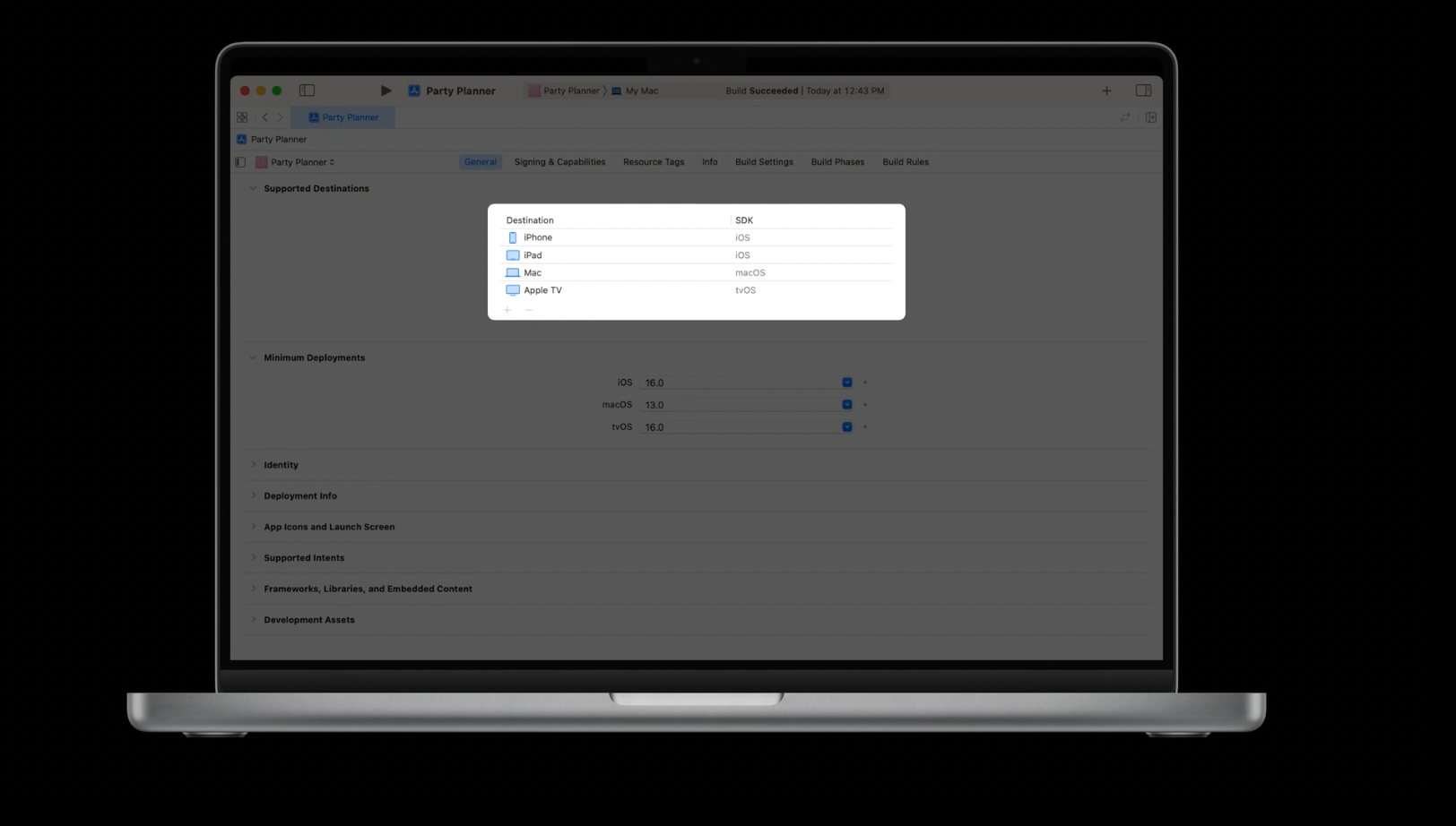
Xcode now has multiplatform deployment targets to handle all this stuff for apps built with SwiftUI.
Recommended to watch:
- [[What's new in Xcode - WWDC22]]
- [[Use Xcode to develop a multiplatform app - WWDC22]]
MenuBarExtra
Now, menu bar items can be built entirely in SwiftUI:
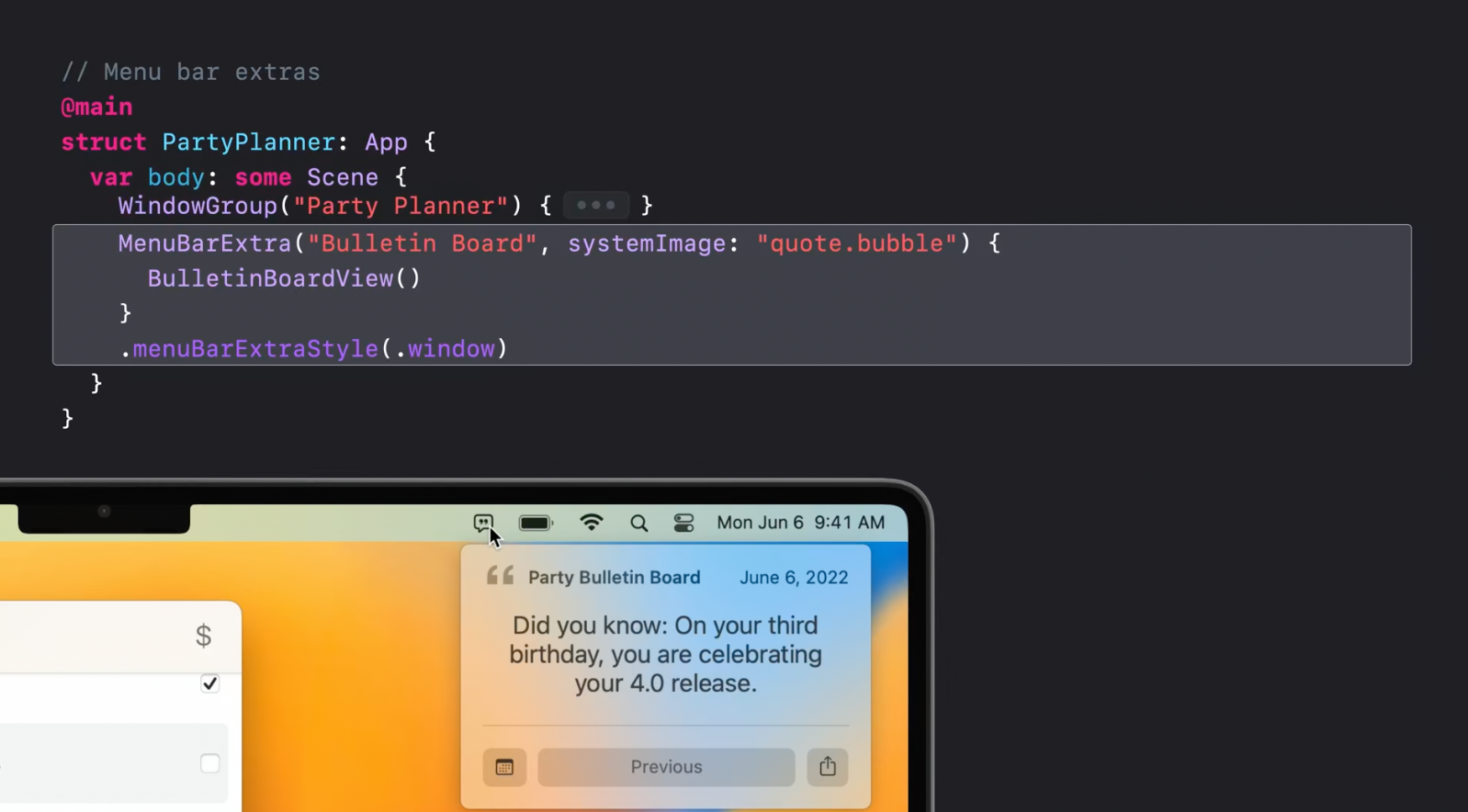
Actually, MenuBarExtra allows building the whole app as a menu bar item.
Recommended to watch:
- [[Bring multiple windows to your SwiftUI app - WWDC22]]
Advanced controls

Forms
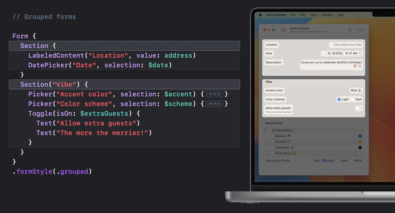
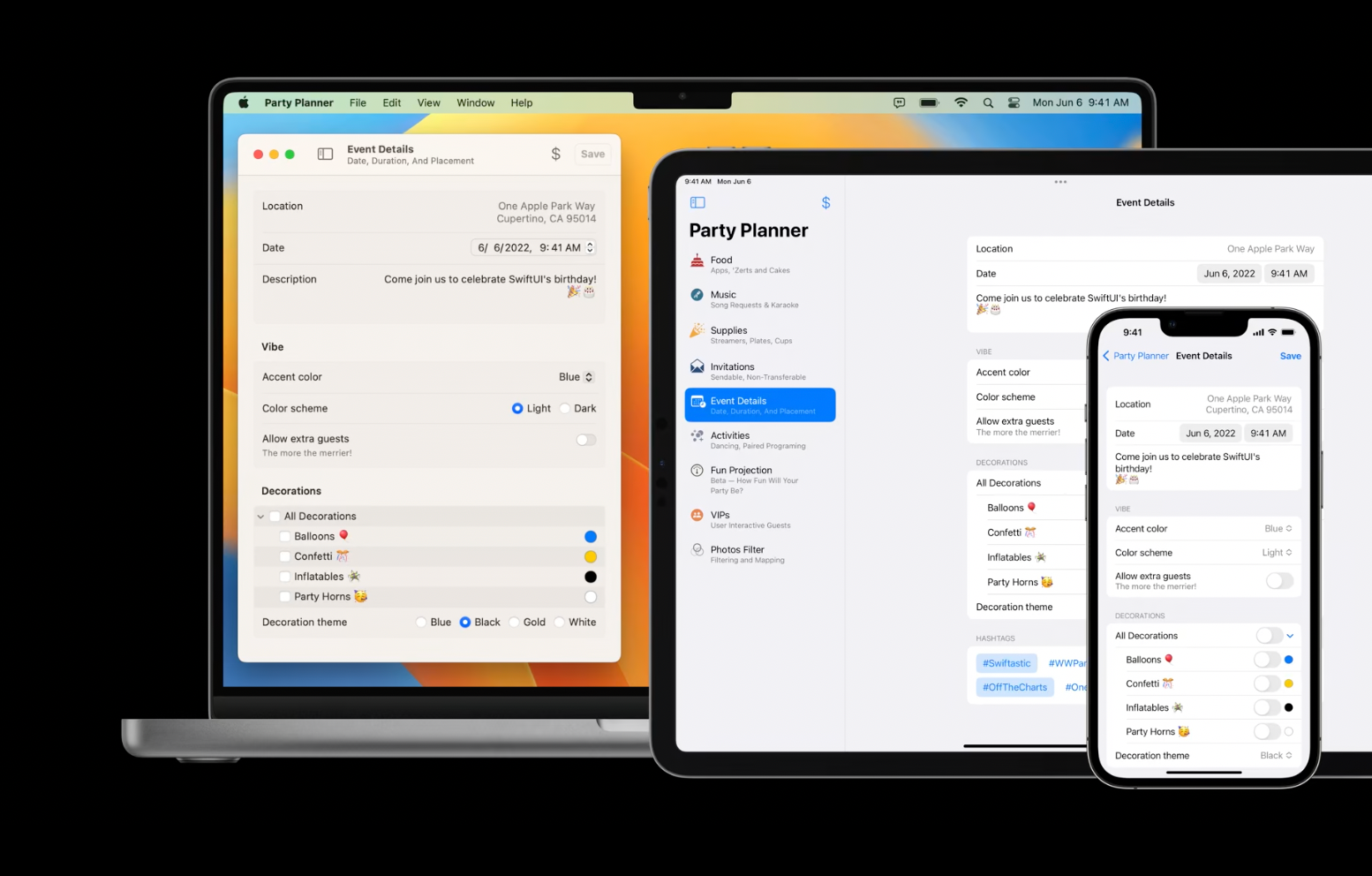
MacOS settings app can be a good example of a neat design of a complicated form. For that purpose, new grouped form style can be used and it will automatically adapt the controls to the new style on MacOS:
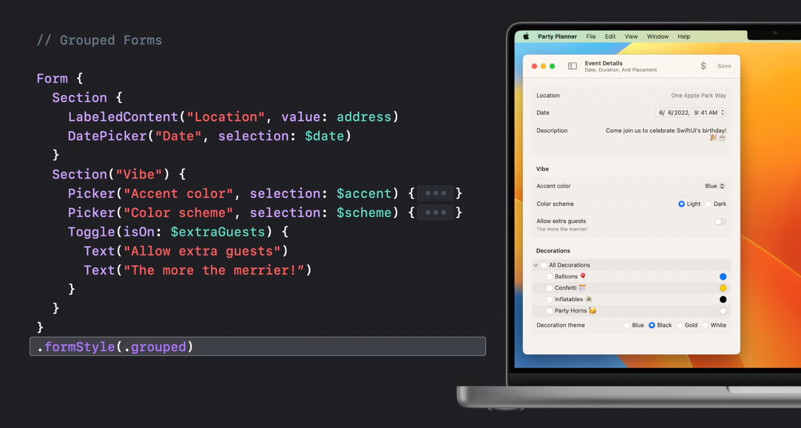
Section would automatically group the set of items:
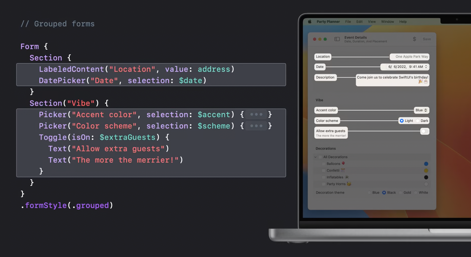
while the items within the section would be properly aligned:
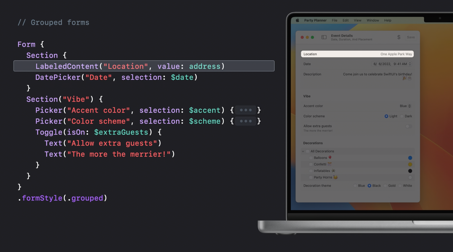
LabeledContent
LabeledContent allows applying the new style to the content controls. New controls can be built with the use of it, or it can be used for read-only info:
The same form view can be used on iOS with its picker controls adopted to iOS style automatically:
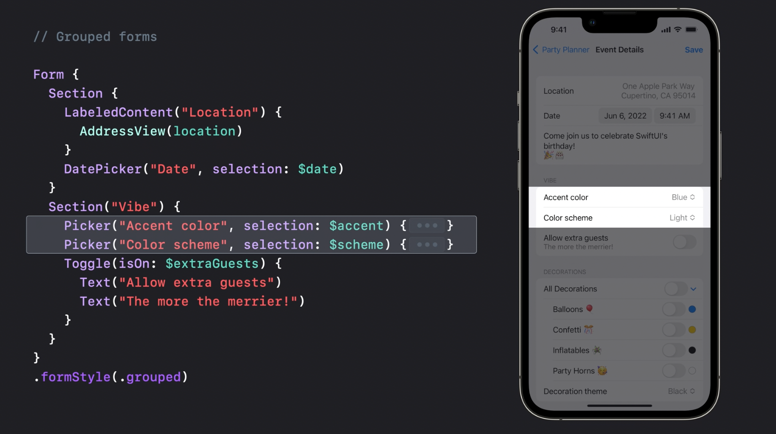
And it also applies proper styling for iPadOS, allowing to share code efficiently between the platforms.
Controls
TextFields
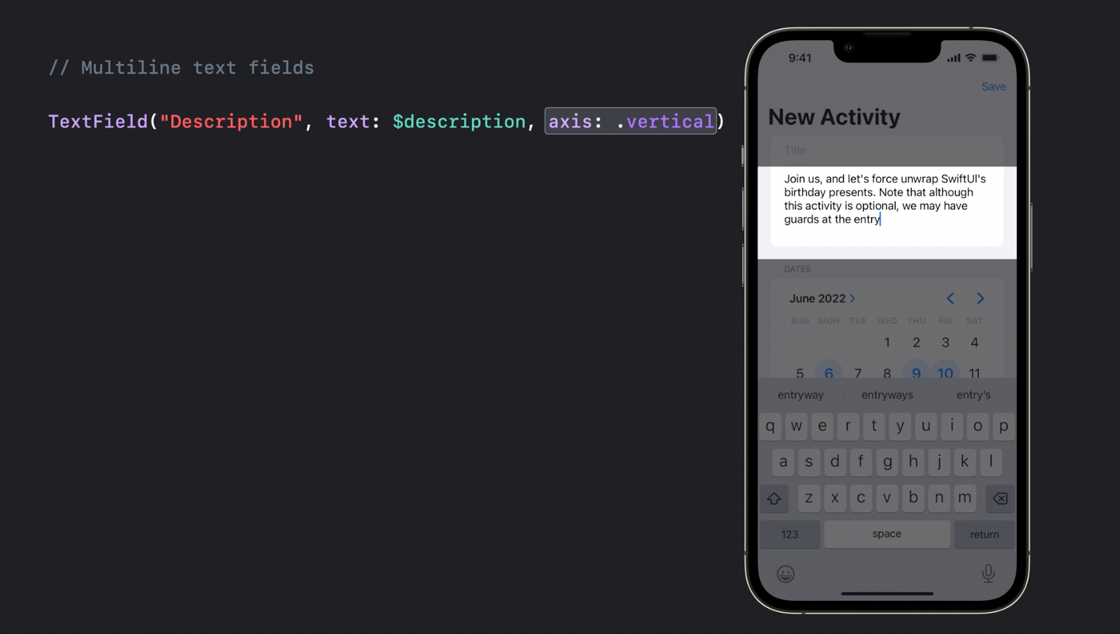
Multiline TextFields that may expand vertically according to specified number of line limit parameters.
MultidatePicker
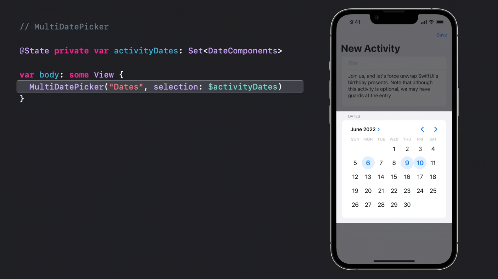
MultidatePicker - yes, please!
Mixed-state controls
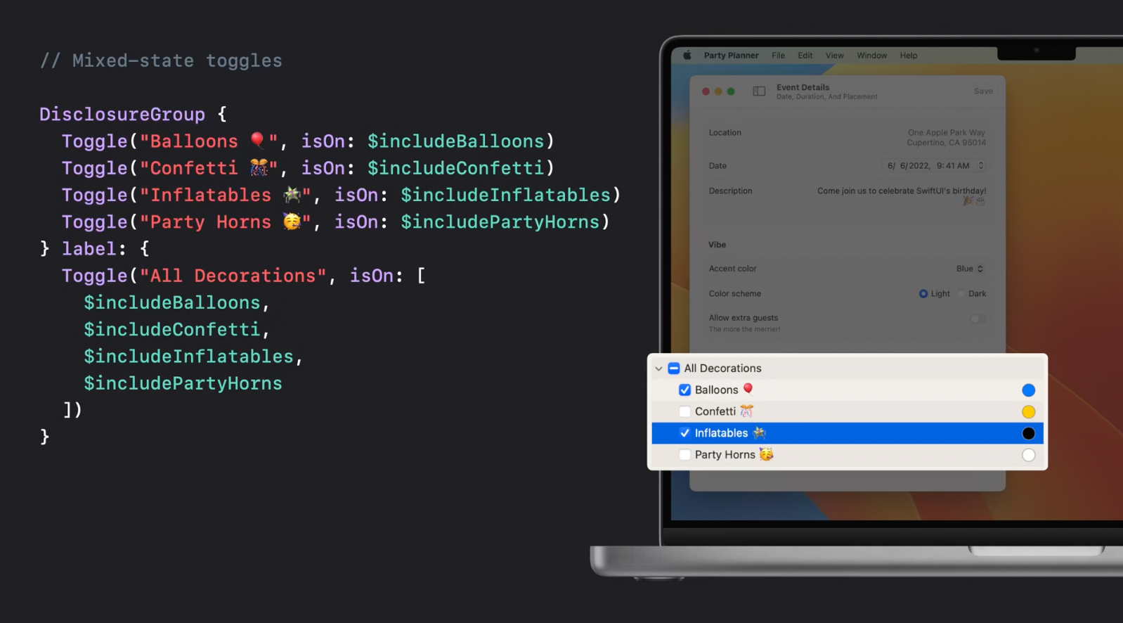
Aggregate toggle may take a collection of bool bindings as an input. In the example below, DisclosureView shows individual toggles or collapses into a single aggregate toggle:
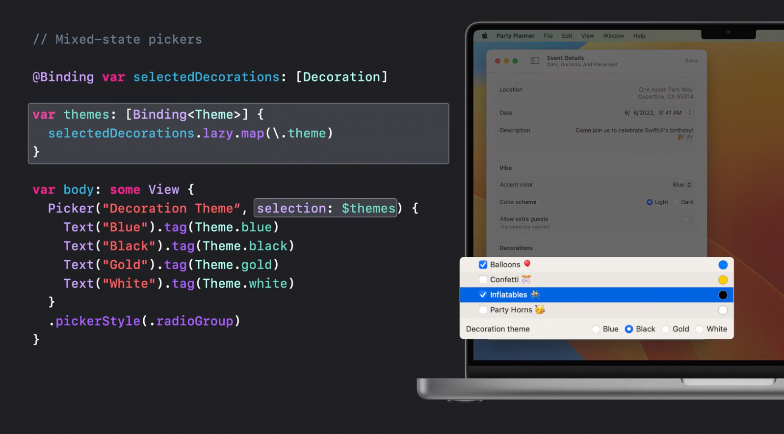
Aggregate picker works in a similar way:
ButtonStyle modifier
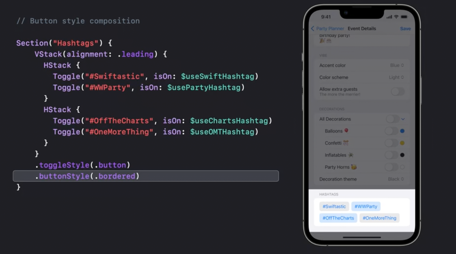
Button style modifier can be applied to all the views in the hierarchy that support button styles: toggles, menus, pickers:
Steppers
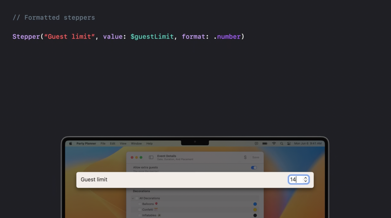
Now steppers support value format:
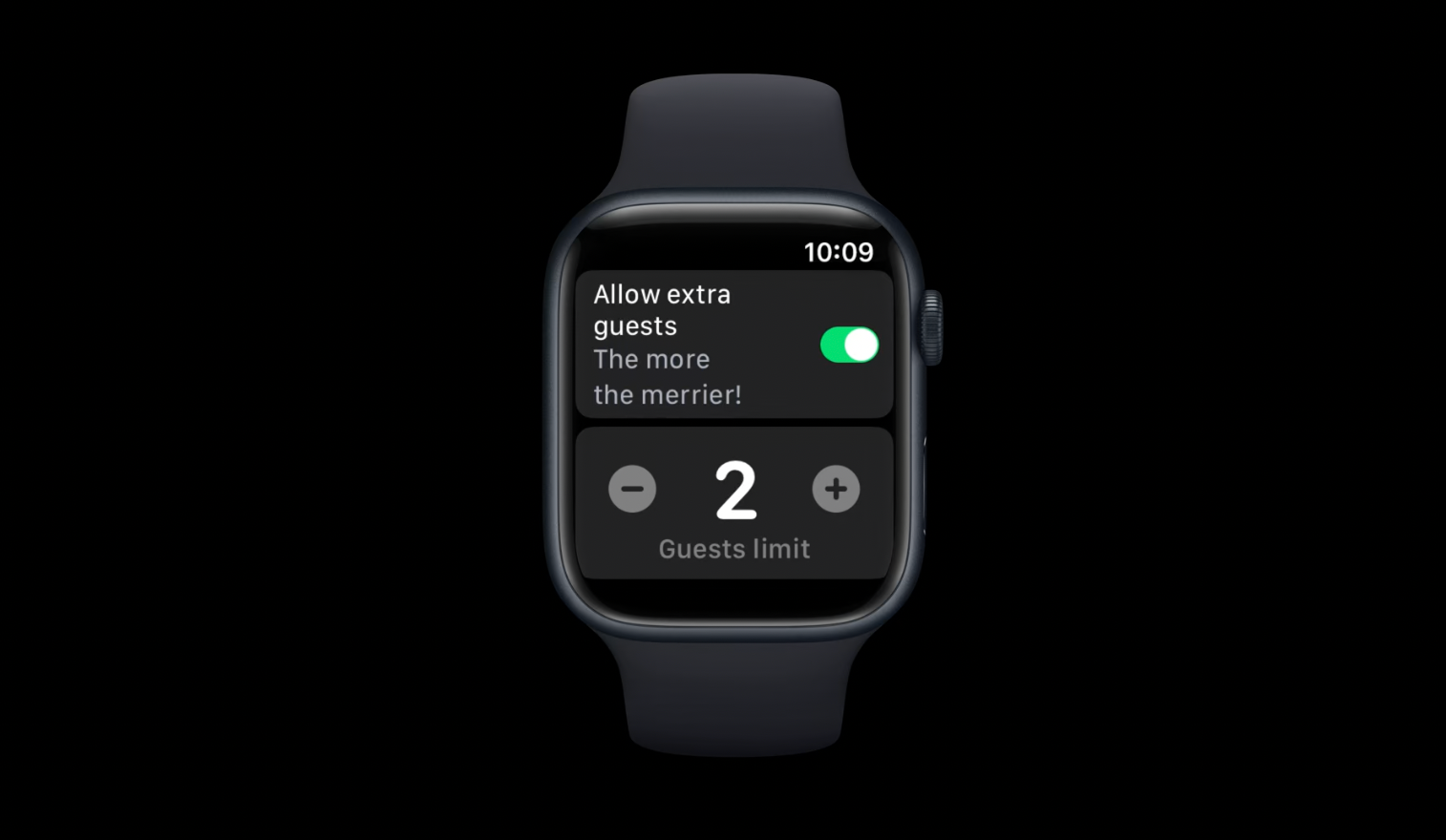
and now they are also available on WatchOS:
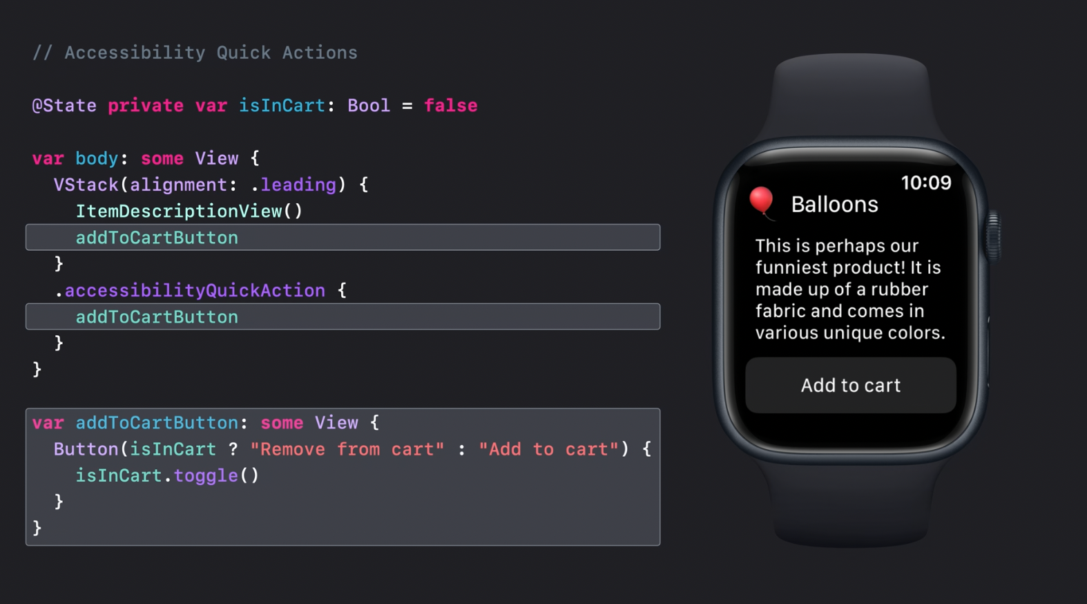
Accessibility quick actions
accessibilityQuickAction is a new feature allowing to define an action that is performed when the user clenches his hand:
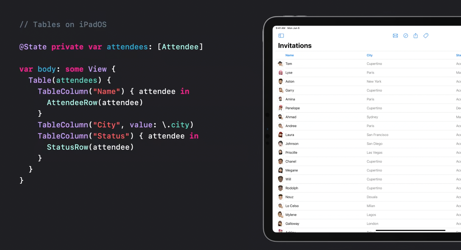
Tables
Tables are now available for iPadOS
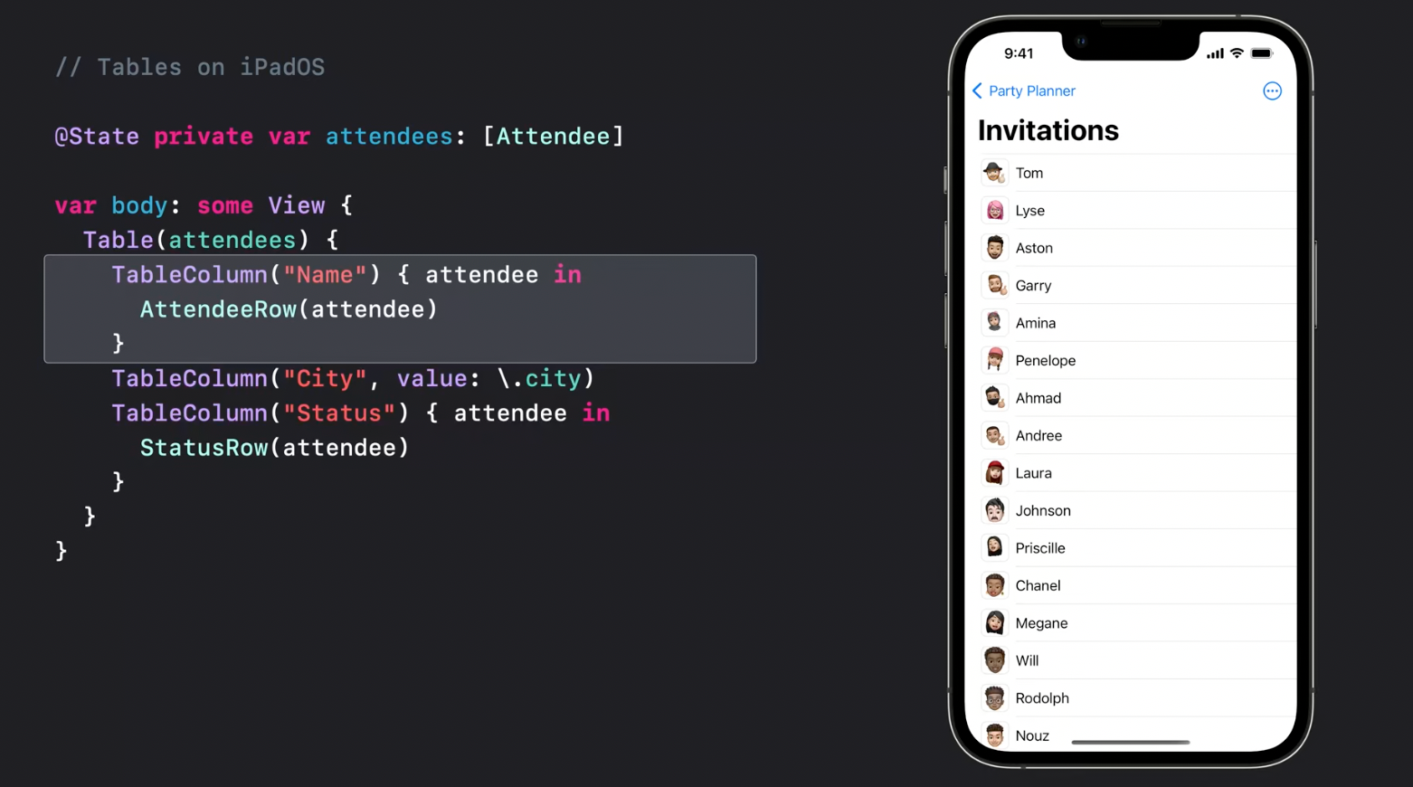
Tables are also presented properly for smaller screen size classes, or on iOS. They simply collapse into the primary column:
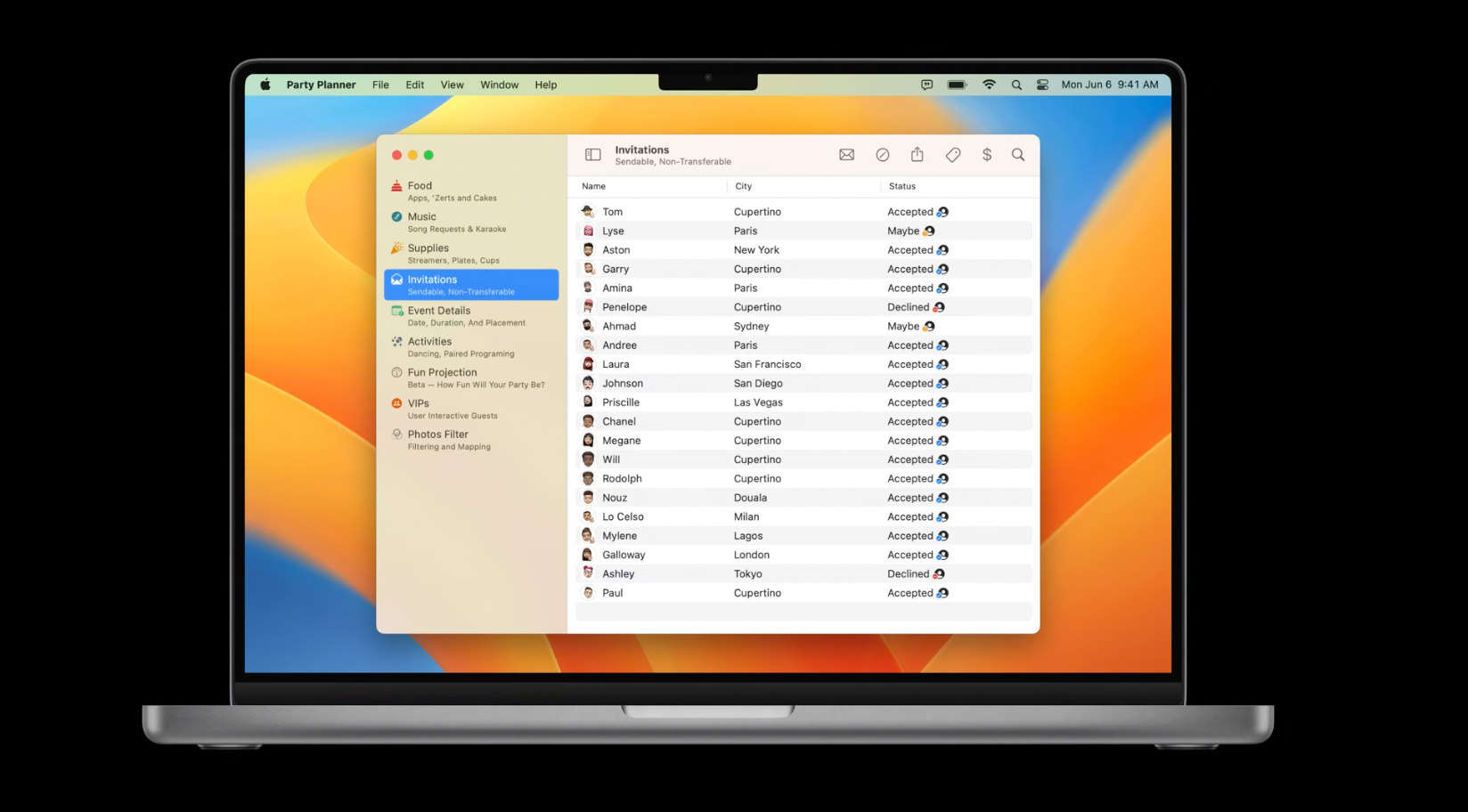
While on MacOS the table appearance would be like this:
Context Menu Selection
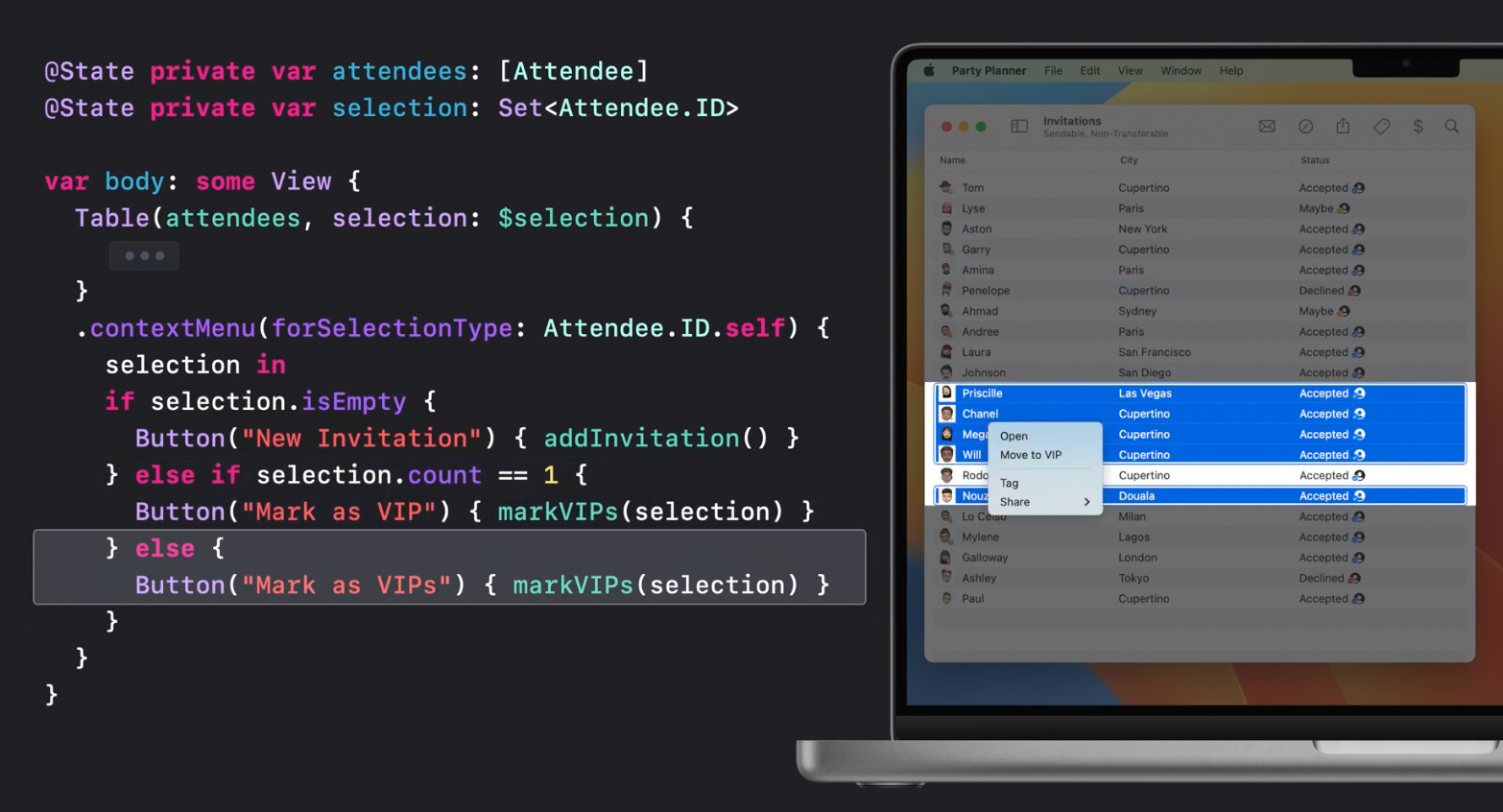
Here is how the context menu selection handler modifier can be added to a Table:
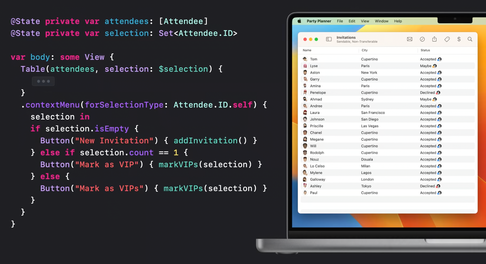
For example, it allows to handle the number of selected rows and present different context menus depending on it.
Toolbar Items
iPadOS has a new toolbar design allowing to add ToolbarItems to it:
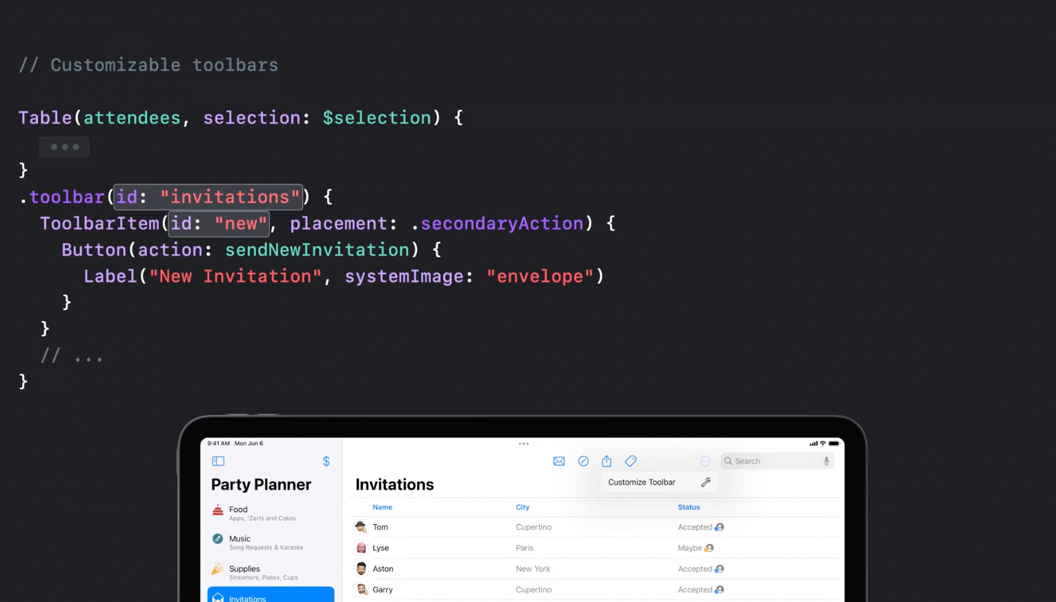
and provide reordering capabilities:
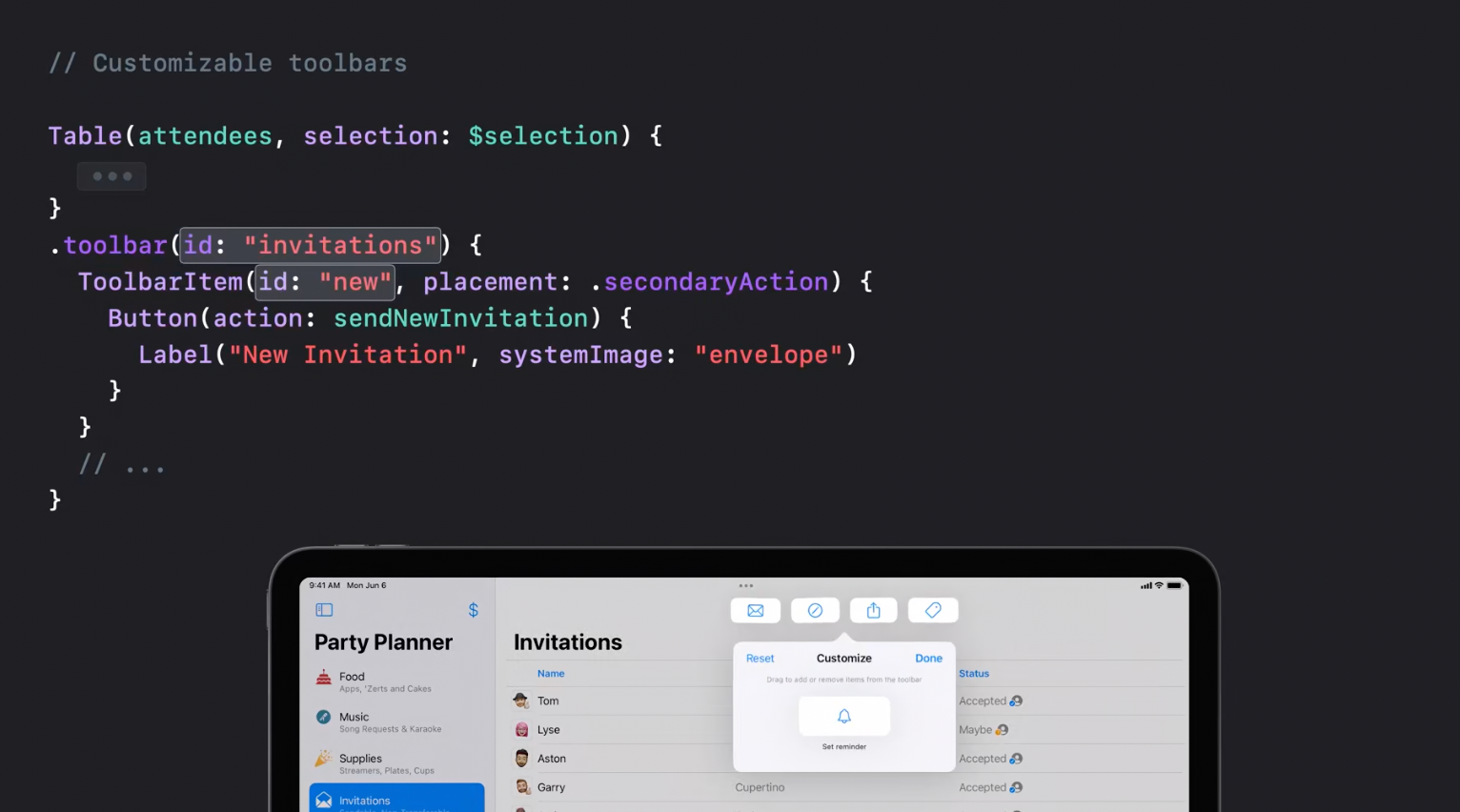
The same API is available for MacOS.
For compact size classes ToolbarItems are available in the overflow menu.
Search tokens
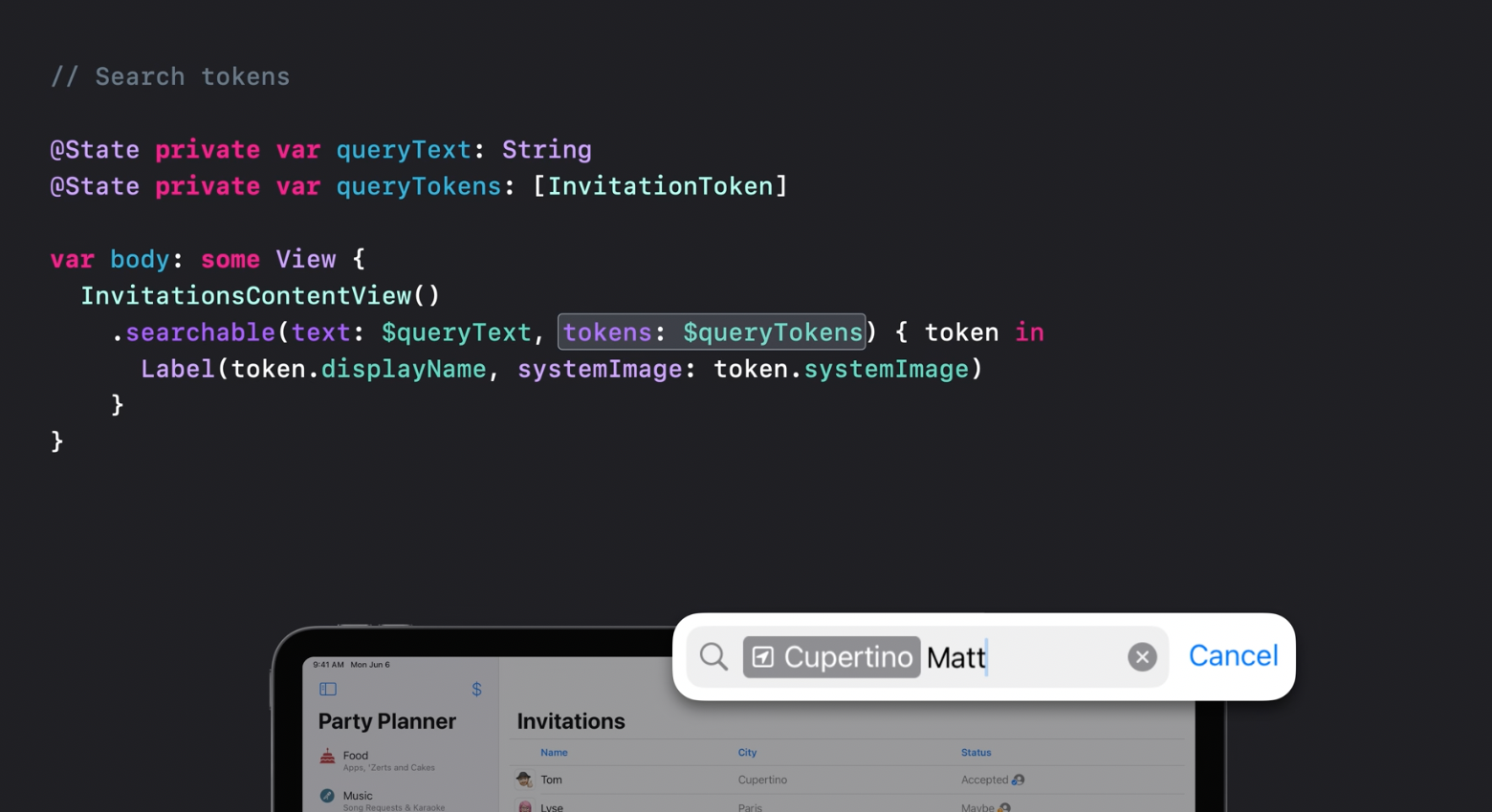
Search modifier now support tokens that allow to present search suggestions.
Search scopes
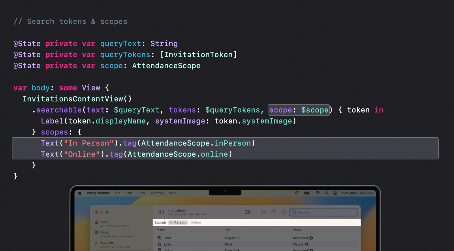
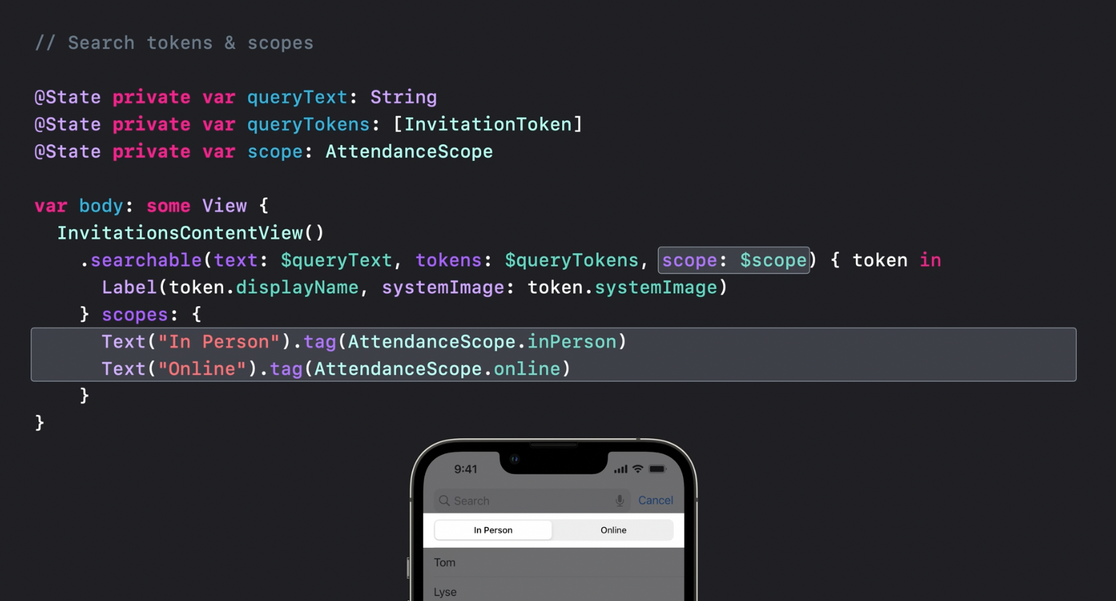
Search scopes are intended to help with filtering search results. They appear on the scope bar below the toolbar on MacOS:
or look like a segmented control on iOS:
Recommended to watch:
- [[SwiftUI on iPad: Organize your interface - WWDC2022]]
- [[SwiftUI on iPad: Add toolbars, and documents and more - WWDC2022]]
- [[What's new in iPad app design - WWDC2022]]
- [[SwiftUI on the Mac: Build the fundamentals - WWDC2021]]
Sharing
Photos
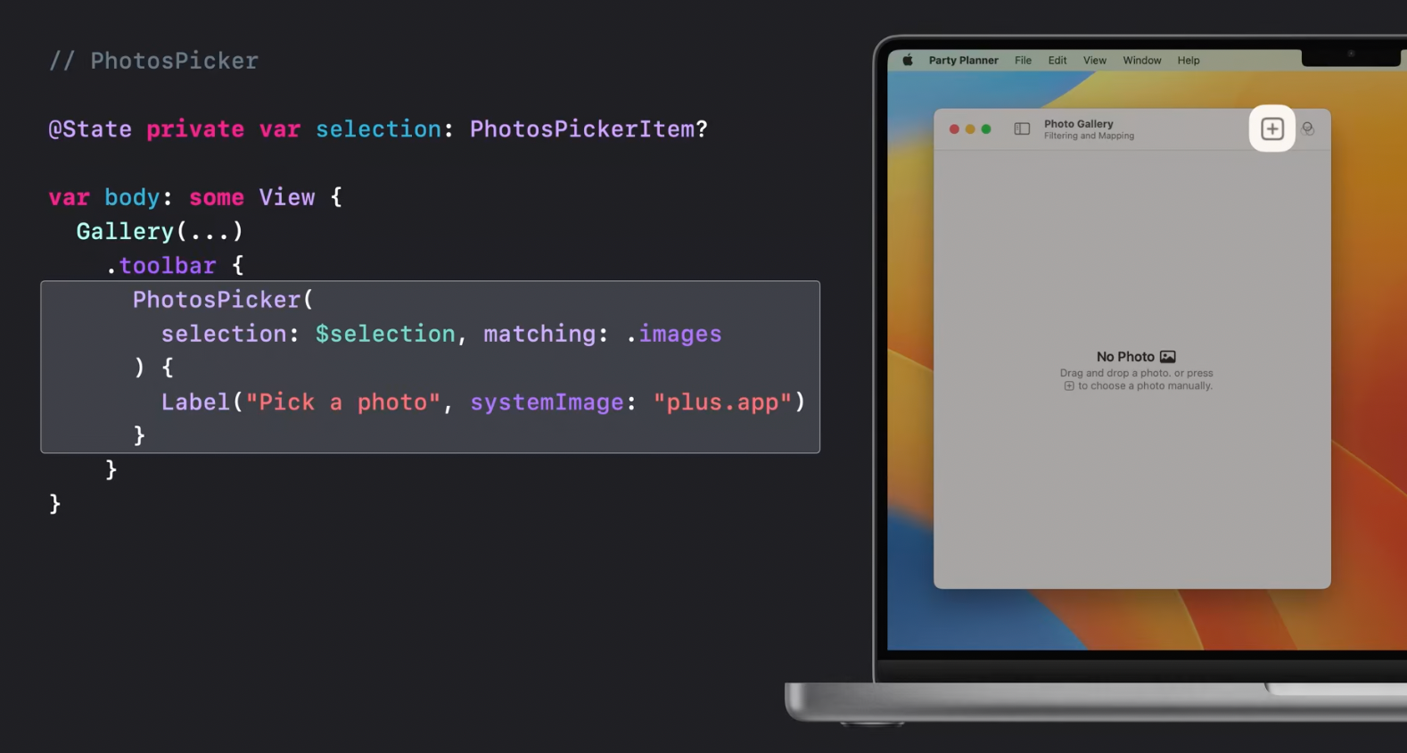
New multiplatform privacy-focused APIs for picking photos and videos. with the help of PhotosPicker view:
Sharing
Each platform including WatchOS now supports its own content-sharing UI:
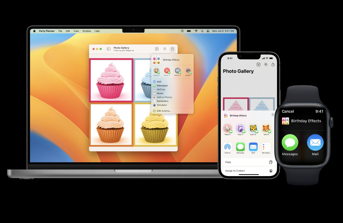
Here is an example of how to use it by adding ShareLink into a toolbar:
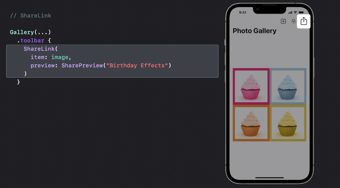
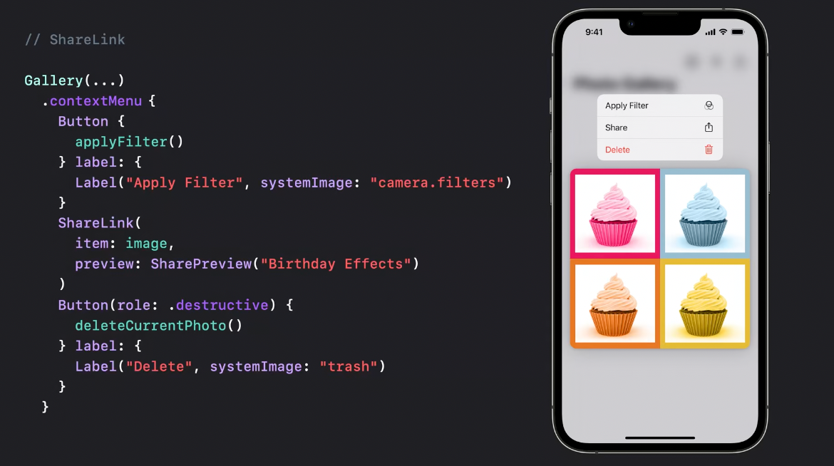
or a contextMenu:
Transferable
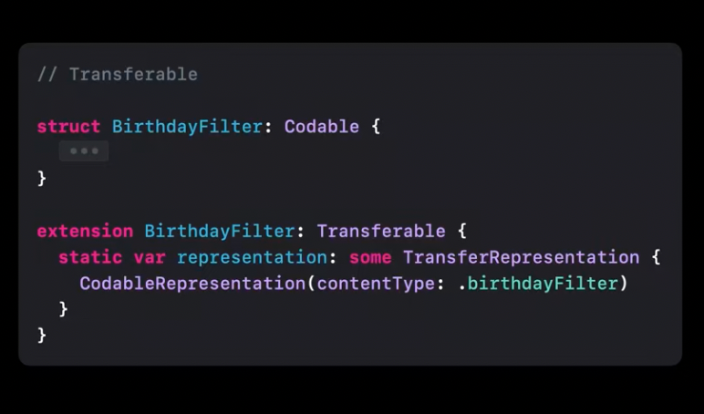
Photos picker, sharelink, and drag-n-drop capabilities are powered with a new Transferable protocol. It describes how types are transferred and allows to share data between apps.
Here is an example of how image drag-n-drop can be implemented with a newdropDestination API:
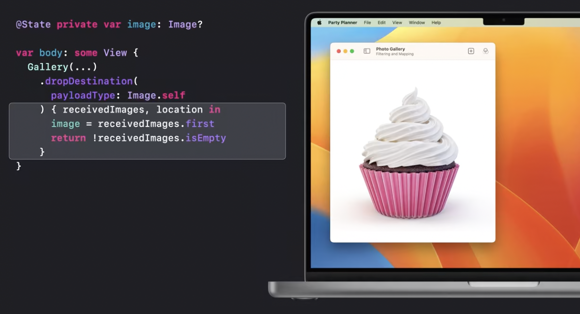
String, Data, URL, AttributedString, and Image already conform to Transferrable and it's also possible to make transferable your own types:
Recommended to watch:
- [[Meet Transferable - WWDC2022]]
Graphics and layout
Shape Style
Color has now gradient property that works with system colors. Shadow modifier for Color allows to apply shadows to text and symbols including the whole set of SF symbols.
Previews
Previews now support variances to tune appearances, size classes, and orientation.
Text animations
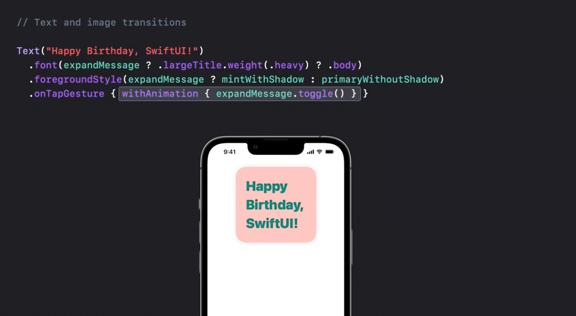
Text font weight, style, and layout can now be animated.
Layout
SwiftUi got a huge update this year deserving a separate session devoted to it.
Grid
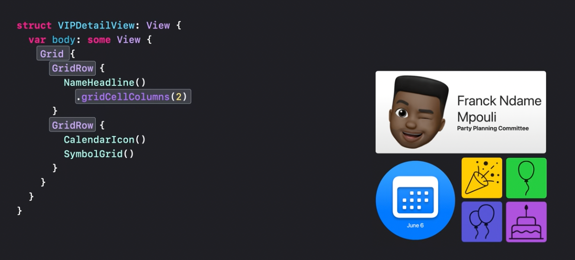
Grid is a new container view allowing to build, well... grids!
Layout protocol
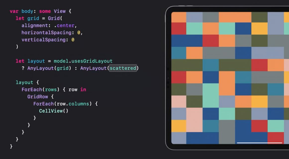
Brand new layout protocol promises to lift complex layouts to an absolutely new level.
Recommended to watch:
- [[Compose custom layouts with SwiftUI - WWDC2022]]
Comments